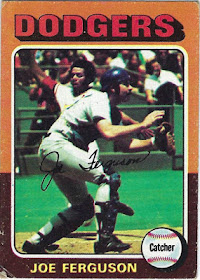
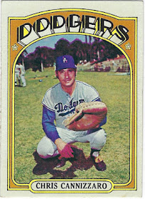
I've now reached the golden age in terms of Baseball cards, the 1970s. In addition to numerous memorable Topps sets, Kellogg's made a name for themselves and their iconic 3D card sets throughout this decade as well. I've already completed 2 Topps sets from this decade (1972 and 1975) and am currently piecing together 2 others (1976 and 1979).
Even with the 1970s containing more well-designed sets than nearly any other decade, I was able to decide the order for this list fairly quickly. There are a couple of so-so sets, a few incredible products, and finally, 3 sets or so that will go down in history as some of Topps' best efforts.
Additionally, one of the main themes of the 1970s, not just for Baseball cards, was the wide range of bright and bold colors. Each and every set makes an effort to include different colors depending on the team with some sets, like 1975 and 1976, having more color than others.
Sets like 1970 and 1971, on the other hand, feature recognizable silver and black borders respectively.
#10 1978 Topps
1978 Topps appears to be the only set that doesn't fit in with the rest of the 1970s set, mainly due to is sub-par set design and its inability to excite collectors. Don't get me wrong, there are still plenty of well-executed cards within the set, and the card backs are fairly strong. However, an image with a white border and a cursive font do little to amaze me given what else is available from this era.
#9 1974 Topps
It's not that the 1974 Topps set has the worst set design of the 70s, that would be 1973, but this set, in addition to 1978, does little to stand out. With nearly every set across the 70s decade being a winner in one way or another, each set is in need of 1 particular factor that sets it over the edge. While it's a respectable all-around set, 1974 Topps doesn't necessarily have that "it" factor to set it over the edge.
#8 1973 Topps
If not for the abundance of awesome images and a wide variety of different angles for said photos, 1973 Topps would end up dead last on this countdown. No matter how much I try, I can't get behind such an uninteresting set design, no matter how intriguing the images are. However, the top tier photos do their part to elevate the 1973 Topps set, a product that would be lost without cards like the Ed Acosta card above.
#7 1979 Topps
Just like 1960 Topps seems to fit in better with the 1950s Topps sets rather than the 60s, 1979 Topps has more of a 1980s style rather than a 70s base set design. As you can tell, Topps began to shy away from using too much color towards the end of the 70s, the exact opposite of what they did in sets like 1975 Topps. My favorite part of this set is easily the old-school Topps logo placed on the Baseball in the bottom left corner.
#6 1977 Topps
As we saw in this years' Topps Archives set, 1977 Topps is certainly an above-average product with big, colorful team names in addition to a variety of different photos. However, in a decade like the 1970s, simply an above average set doesn't get you much higher than 6th on the list, a testament to how strong the decade remains, even to this day, for Topps Flagship sets.
#5 1970 Topps
Now that I'm into the top 5, I've reached some of the greatest Topps sets of all-time in addition to the best products that the 1970s has to offer. In terms of the 1970 Topps set, I'm incredibly excited to see this grey-bordered set return for 2019 Topps Heritage. I've always loved the simplicity of the grey-bordered design, even if it does become slightly repetitive in the 720-card set.
#4 1976 Topps
I really wish this set got more attention, because 1976 Topps, to me, embodies the 1970s as a whole more so than nearly any other product released that decade. I love the All-Star stars especially, something that we should see more of since All-Stars players are supposed to be considered stars The amount of color on the card is perfect, but it's the photos, especially Johnny Bench's card, that make the set what it is.
#3 1975 Topps
1975 Topps would likely crack the top 5 on my countdown of favorite Topps sets of all-time, but in a decade like the 70s, the highest I can rank it is #3. The best thing about the set is that because of how many color combinations there are, I can never find myself bored while looking at 1975 Topps cards. Nearly every part, from the size of the team name to the position on the baseball, is frankly brilliant, a testament to the peak of Topps' greatness in the early and mid-1970s.
#2 1971 Topps
If Topps could execute another black-bordered Flagship set as well as they did back in 1971, it would easily become the best selling Flagship set of this century, and rightfully so. Simply put, the 1971 Topps set is a stroke of genius in many different ways. The borders are just the right size while there's nothing too crazy going on. Each tiny bit of space is maximized while also making sure that the card isn't cramped.
Plus, who doesn't like black borders?
#1 1972 Topps
Not only is it the best set the 70s has to offer, but 1972 Topps will forever hold the title as my favorite Topps set of all-time, a true masterpiece of a set. Even without including the player's position on the front of the card, 1972 Topps is a beautifully designed set with a perfect balance between the color, team name, and image, all taking the shape of an arch.
The font that the team name is written in combined with the shading is very 1970s, the best compliment I can give a sit like this. Not only is it the best-designed set I've ever seen, but it's the first Topps set I ever completed myself, I milestone I reached earlier this year.
The 1970s had more fantastic sets to offer collectors than any decade in Baseball history. Next up, I'll go over the 1980s, a decade that for better and for worse, changed Topps Flagship sets forever.


Here goes. Starting with the best
ReplyDelete71,72,75,73,74,76,70,79,77,78
This is the era where I collected the most
I always thought the 78 set was the best of all time. Funny how you have it last here. The cursive, readable and properly colored team name worked. Although not The first set with this, the baseball with position inside of it was always a good idea. What makes it the best is the All Star badge logo. It's the best All Star logo Topps ever put out. I always loved how it was red white and blue from top to bottom for National league and blue white and red top to bottom for American league. Set also included their classic Topps rookie trophy which I always liked...looks great in the classic Eddie Murray rookie card. Always loved the managers card and it had their playing days stats. As a kid I bought these by the pack we especially loved the back and often played the game on the back of the cards. No set after that ever compared in our minds. The sets before were good but not quite like 78.
DeleteSo before reading this I had a debate with a friend. I said the 72 topps set is amazing. That is screamed 70s to me and was just beautiful to look at. The 72 joe morgan to me is my favorite card of the set for me personally. Glad to see someone had as good as taste as me. Thanks for the fun read.
ReplyDelete