Showing posts with label throwback jerseys. Show all posts

Friday, November 15, 2019

Frankenset Page #71

It's crazy to think that by the end of this month, my 74-page frankenset series will likely draw to a close. I seem to be averaging one of these pages every week or so, so it stands to reason that the series will officially be wrapped up towards the end of the month.

Today's page is #71 in the series, featuring cards #631-639 that span 5 consecutive decades (the 1970s-2010s).  Let's get started.

#631 1983 Fleer Pride of Venezuela
This combo card may be the first of the page, but I'm already declaring it my favorite just like the Big Red Machine from the previous frankenset post. Both Trillo and Concepcion were entertaining players to watch in the late 70s and early 80s, especially when the former was a member of the Chicago Cubs.

Plus, there's something harmonious about the 2 red uniforms and the basic silver-bordered '83 Fleer design. There's just, to put it simply, a lot to like about this card.

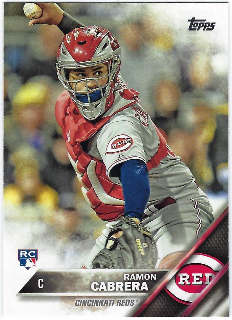
#632 2016 Topps Ramon Cabrera
I could get into my issues regarding the 2016 Topps set yet again on the blog, but I'll refrain from that and instead focus on the fact that Topps did a nice job with this card.

Look, the card isn't groundbreaking or extraordinary, but I always love the way a catcher's action card looks as he prepares to throw the ball in an attempt to prevent a runner from stealing. If nothing else, the mediocre to put it kindly nature of the 2016 Flagship set didn't stain this card.

#633 2006 Topps Josh Barfield
I don't know if Topps was attempting a combination of modern and retro with the 2006 Topps design. All I know is that the color pairing did not work out very well as far as the San Diego Padres' cards are concerned.

Orange and brown may have looked great together back in the 1970s when Topps could make virtually any color combination work, but the same can't be said when a silver foil design is added to the mix.

#634 2013 Topps Drew Smyly
Over the last few years of Topps Flagship, particularly 2019, I've noticed a resurgence in retro uniforms making appearances on base cards. The inclusion of these throwback jerseys is something that I'm quite happy about, for they weren't always as common as they are now.

To be quite honest, I don't recognize the jersey that Drew Smyly is wearing in the card above.

#635 1978 Topps Joe Rudi
Joe Rudi remains one of my favorite members of the Swingin' Oakland A's teams from the early/mid-1970s, but by '78, Rudi was no longer playing in the Bay Area. He joined the California Angels after the 1976 season and remained there until '81 when he played for the Boston Red Sox for a year.

After a down season in Boston, Rudi spent 1982, the final year of his career, back with the Oakland A's. Interestingly enough, he hit a home run in his final MLB at-bat.

#636 1992 The Sporting News Conlon Collection
Don't get me wrong, I'm incredibly fond of the breathtaking 1992 Sporting News Conlon Collection set. However, I don't want the cards to be featured too frequently and, thus, become repetitive.

With that being said, the photography, no matter how many cards I look at, never fails to impress me. The fact that hundreds of Conlon's photographs were compiled into one cohesive set is nothing short of extraordinary.

#637 2010 Topps Prestigious Pinstripe Power
The 2010 Topps set, even as far as this decade's Flagship products are concerned, does very little to impress me. The overly-large font used for team names is about the only thing that sets this design apart from others, and that's not necessarily a positive attribute.

It seems to me that this set is forgotten amongst all the others that have been produced this decade, and in my eyes, Topps should be thankful for that.

#638 2015 Topps Jimmy Rollins
Seriously, all you have to do is look at 2010 Topps next to a card from the 2015 Flagship set to understand what I'm saying. Topps has produced 20 base sets this century and as far as I'm concerned, none of them have come close to rivaling the colorful and vibrant 2015 design.

#639 1987 Topps Gerald Perry
 Last up, a card from 1987 Topps, a set that we haven't seen featured on one of the frankenset pages in a little bit. As a result, I have slightly more positive feelings towards the wood-bordered set, because I haven't seen any of its cards in quite some time.

Saturday, March 9, 2019

Unbelievable Uniforms

Anytime I turn on the TV to watch a game or look at a Baseball card, the first thing that I instantly take notice of is the uniform that the players are wearing. In some cases, the jersey being worn by the player can either make or break the card itself.

Nowadays, respective home jerseys and road uniforms begin to blend together and not stand out as much as they used to. Even the road and home alternates, intended to be colorful and unique, aren't eye-catchers either. 

Rather, it's the bold and outlandish jerseys of the 70s and 80s that continue to be my favorites to this day. The bright-colored uniforms of that era easily outshine the pedestrian jerseys of today, making me all the more excited for the rare days in which old-school uniforms are worn.

Moreover, it doesn't help that throwback jerseys and retired players are starting to become short-printed in Baseball card sets. 5-6 years ago, I'd have no problem pulling a card featuring a retired legend or a 70s/80s uniform. 

Unfortunately, Topps' monopoly on the MLB license has made it increasingly difficult to come across these once fairly common cards.

Even though there are some memorable jerseys worn in Baseball today, the majority of them can be traced back to previous decades, something I'll be exploring across this post.

I started off by featuring the classic Boston Red Sox home uniform at the very top of this post. Now, I'm moving onto a separate iconic uniform that's still worn today; the New York Yankees' home jerseys. When referring to pinstripes, the Yankees are likely the first team that'll come to the mind of any Baseball fan, an immediate sign of how recognizable their home unis are. 

I'm not certain of the exact timeline, but the Yankees have had their pinstripes for decades now, and this uniform has since established itself as one of the most famous jerseys in Baseball history. As special as they are, I typically prefer something a bit more colorful.

I doubt that most MLB clubs have sported a wider variety of uniforms over the course of their team's history than the Chicago White Sox. Though they've had their current home uniforms for ages now, the 70s-90s have seen this team introduce an unprecedented number of different jerseys.

I could seriously dedicate an entire post just for different White Sox unis; we've had the red stripes, powder blue, shorts, etc. I've selected a couple for my post, one of them being the black White Sox shirts and pants, introduced in the late 1970s.

Introduced roughly a decade later was the next iconic White Sox jersey. Only this time, there was a logo that matched part of the uniform as well. Encompassing white, red, and a very dark blue, it was this uniform, included in yesterday's post, that inspired me to develop this very idea in the first place.

Worn my greats like Tom Seaver, Steve Carlton, and Harold Baines, these White Sox unis didn't last as long as I would've liked. However, they are often brought back as throwback jerseys for a couple White Sox games every season.

The Montreal Expos may not exist any longer, but it's their powder blue uniforms that have cemented their legacy as a fan-favorite team, even to this day. Worn by Hall of Famers like Dawson, Carter, and Raines, the Expos wore a few different jerseys across their team history, but none as memorable as the original powder blues.

Even though they've always been one of my favorite teams, an MLB documentary titled "The Colorful Montreal Expos" gave me a whole new appreciation for the Canadian club, especially their eye-catching uniforms.

The final 3 teams featured represent not only some of my favorite jerseys in Baseball history but 3 of the most iconic unis of all-time as well. Everything about the 1970s was colorful when it came to Baseball, from the card sets to the logos. Still, it was the uniforms worn by a few teams in particular that truly stood out.

Before their bold black and gold shirts and pants became a staple for the franchise over the course of an entire decade, the Pittsburgh Pirates sported traditional-looking home and road jerseys as shown above. 

The simplicity is what I admire most about these cards, but I'm more of a stickler for more colorful jerseys

Whether the shirts and pants were all-black, all-gold or a combination of both, the mid to late 1970s sparked a major change in the Pirates uniforms. Over the course of just a few years, the team strayed away from more traditional and basic unis and ventured towards something far more exciting. 

The result; one of the most dynamic uniforms this game has ever seen and a World Series title for Pittsburgh in 1979.

The same thing could definitely be said regarding the "Swingin'" Oakland A's, but their change occurred a few years earlier than the Pirates'. Because of the unique nature of their owner, Charlie Finley, the A's were an odd team for a number of reasons. 

The names, the antics, and of course, the jerseys helped make them one of the craziest teams Baseball has ever seen, a perfect representation of the 1970s. With that being said, this crazy club went on to win 3 Fall Classics, all back-to-back, from 1972-1974.

And even though I left out a few possible candidates (powder blue Brewers, brown and gold Padres), my decision remains unchanged; the "rainbow" Houston Astros uniforms are undoubtedly the greatest jerseys in the history of Major League Baseball, and maybe even all of the professional sports. 

Yes, teams had certainly introduced crazy and colorful uniforms before Houston, but no jersey remains as memorable in the present day as the Astros' rainbow unis. Cesar Cedeno, J.R. Richard, and of course, Nolan Ryan wore these out of this world uniforms while also playing at the equally-revolutionary Astrodome.

The combination of these jerseys with the venue in which they were worn in made for something Baseball hasn't really seen before or since. And if you take a trip to Minute Maid Park today, you're bound to see at least a few fans wearing these unbelievable uniforms.

Thursday, January 17, 2019

Frankenset Page #37

With a long weekend coming up, I fully intend to devote some of the time towards creating a well-organized Red Sox team collection. The problem is, I don't really know where to start.

Yesterday's Red Sox-only package from the Team Collector's drew attention to the fact that while I have organized my Red Sox player collections almost meticulously, I haven't been able to do the same for the rest of my Sox cards. 

These are the cards of the players I don't collect, and my inexperience with team collecting has left hundreds of pages of cards in a binder without the proper means of organization. The problem is, I don't exactly know how to organize them.

Currently, I have the idea to keep the cards organized by decade and later by year as I continue to acquire more cards, but I'm not sure if that's the best way to do things. With all sorts of Red Sox player collections, it would be impossible to build team sets of my choice given I collect a couple dozen different Sox players.

Because of that, I think organizing these cards by decade and eventually, by year, would be my best bet. However, any tips from other team collectors would be greatly appreciated.

Now that I've talked about my Red Sox team collection, let's move on to the 37th page of my frankenset. Page #37 starts in 1967 Topps with card #325 and continuing through 1991 Fleer and card #333. All in all, 5 different decades are represented across this page.

#325 1967 Topps Chico Cardenas
Chico Cardenas' card is one of the first that comes to mind when I think about the 1967 Topps set. It's not a product I'm super familiar with, so cards like Cardenas, Yastrzemski, and Banks have become easily recognizable for me. Everything about this card, from the colors to the holding of the Baseball, serves to represent 60s cards very well.

#326 1998 Bowman Alex Ramirez
It's cards like this one, featuring what appears to be a Spring Training shot, that gets me excited for what's to happen in Baseball over the next few months. With less than a month until pitchers and catchers report, we're slowly but surely starting to see Baseball start up again. Plus, there are only just over 2 months until Opening Day.

#327 1958 Topps Gary Bell
The 2nd vintage set to appear on page #37, 1959 Topps is a classic set that we've had the pleasure to see reproduced twice, once in 2008 Topps Heritage and just last year in Archives. 

The set seemed to fix any major problems from the 1958 set while creating a unique design with lots of well-executed features, specifically, the amount of color Topps included while still having enough space for the picture.

#328 2013 Topps Gypsy Queen
Seeing this card today reminded me of the fact that Denard Span played for the Washington Nationals. A journeyman throughout his career, Span has played for the Twins, Giants, Rays, Mariners, and I'm sure there are other teams I'm forgetting in addition to the Nationals. While I wish the photo was a bit clearer, I like the inclusion of the rarely-shown dark blue Washington jerseys.

#329 1984 Topps Pat Tabler
Speaking of rarely-utilized uniforms, I don't see these navy blue Cleveland Indians uniforms from the 80s on cards all too often. Typically, the 70s promote the all-red jerseys while the 80s focus on the all-white uniforms, leaving very few cards with what I believe to be some excellent jerseys, the dark blue home uniforms. 

#330 2014 Topps Daniel Webb
I might as well continue to talk about uniforms since this Daniel Webb card from 2014 Topps is giving me a good reason to. That's because the iconic White Sox uniforms from the 80s are shown on this card as a throwback, and they're easily some of the best jerseys I've ever seen in my life. Seriously, who could look at these awesome, colorful uniforms and not get excited?

From what I see, the White Sox use them as throwbacks somewhat often, an excellent decision, in my opinion.

#331 1985 Donruss Jeff Reardon
The black-bordered 1985 Donruss set could possibly be the greatest Donruss product ever released, and it would be even better if the company could up their game when it comes to card backs. Even with that being said, black borders, no matter how thick or slim, look superb on cards, and it's time for Topps to realize that again and use black more in Baseball card base sets.

#332 1998 Bowman John Halama
Is it me or is the Astros logo on this card unusually small? I don't think I've ever seen such a small logo ever on a Baseball card before. And the thing is, the other 1998 Bowman card on this page features a normal-sized Cleveland Indians logo, leading me to wonder what happened to John Halama's card here.

#333 1991 Fleer Darnell Coles
I'd be remiss if I didn't point out the fact that this picture was taken at Fenway Park, the Green Monster really serving to enhance the rest of the card. Seeing the Citgo sign in the background brings back a lot of memories of going to Red Sox games. I'm definitely longing for Baseball to come once again even more after looking at this card.