Monday, August 19, 2019

A Newfound Appreciation

In between my purchases at The National in Chicago earlier this month, I had time to stroll around the show floor, glancing through the display cases that held unbelievable cards.

Don't get me wrong, the modern cards intrigued me quite a bit. I saw around a dozen Wander Franco 1st Bowman autos together in 1 case, a Benintendi superfractor rookie card from 2017 Topps Chrome, and Pedro Martinez and Vladimir Guerrero dual autographed booklet (both on the Expos), just to name some of the highlights.

However, my eyes were primarily drawn to the display cases of graded vintage cards that I so frequently looked at during my time at the show. Most of the cards didn't even have price tags, so I knew they weren't in my budget whatsoever.

Nonetheless, just seeing Mickey Mantle rookie cards in-person is a memorable experience in its own right.

Out of all the vintage sets, I found myself taking notice of 1953 Topps more and more. Solely because of how old the product is, I've never been able to familiarize myself with these beautiful cards. In fact, I only began appreciating the set when Topps Living was released last year.

The checklist is incredibly small (280 cards), but when you take into account cards like Mickey Mantle, Jackie Robinson, and Satchel Paige (whose name Topps spelled incorrectly in the '01 Archives card above), it would be nearly impossible to complete.

'53 Topps has often been viewed as an over-used Flagship set, and I guess I can't really disagree with that argument. For starters, Topps paid tribute to this iconic design in the early 90s with an all-1953 Topps Archives set, the first installment in a series that would be revived twice more.

I'm not overly familiar with this release, but I have enough cards to know that Topps didn't do that good of a job recreating their 2nd Flagship set. The original 1953 Topps Cubs cards had a black banner like the 1st card, not red like Roy Smalley's. Not to mention, the cardstock was nothing like it was in '51.

Not only do I not have a single original '53 card, but I'd also be surprised if I had more than 3 cards from the 2002 Topps Heritage set that's modeled after the original set. 

Given that 2002 Topps Heritage hobby boxes are going for $150 on eBay, I don't think I'll be seeing many cards from that set anytime soon. In fact, the closest I've gotten to authentic 1953 Topps cards is thanks to 2016 Topps Archives. 

Still, like the previously mentioned Archives release, they didn't do the greatest job recreating the set. I realize nothing can beat the original, but this card stock was just far too thin, and the checklist wasn't that great either.

Topps Living is likely the closest I'll get to the real thing, but the cards are too pricy ($8 for 1 or $15 for 3) for me to purchase on the Topps website. I never really think to buy them on eBay afterward, and they never seem to turn up at the Baseball card show either.

Last year, I used an eBay coupon to purchase my 1st Topps Living card for around 70 cents. I chose Clemente because, as a retired player, his card was actually cheaper than that of modern guys, especially rookies.

Speaking of rookie cards, I should've just gone for it and purchased Fernando Tatis Jr's card when it was first listed on the Topps website. After all, he's easily my favorite rookie of 2019, so I might just pick one up of eBay when I have the chance.

Although I have this newfound appreciation for 1953 Topps, I don't have many means of acquiring original or reprinted cards from this beautiful set. I may just start buying individual cards if I have the opportunity to do so at the Baseball card show.

I likely won't be trying to complete the set or anything. I just want to get my hands on this gorgeous set.

Sunday, August 18, 2019

Top 5 Cards; Starlin Castro

At one point, Starlin Castro seemed like the franchise player of the Chicago Cubs for years to come. The 4-time All-Star had a fabulous rookie season in 2010 when he hit .300 and drove in 41 runs.

Over the next 5 years in Chicago, he came within 9 hits of reaching the 1,000 hit mark while achieving a respectable .281.

Following the Cubs' turnaround season in 2015 that saw them make the playoffs, Castro was traded to the New York Yankees for Adam Warren and a player to be named later. Though 2015 wasn't the greatest season in his relatively young career, the Cubs seemingly gave up on Castro in favor of their new rookie SS Addison Russell.

Castro spent 2 years with the Yankees. This included an All-Star 2017 season in which he helped lead New York to an ALCS appearance. However, for the 2nd time in his career, Castro was traded away from a team as soon as they made it back to the postseason.

This time, he was traded to the Miami Marlins in the Giancarlo Stanton deal. I've always believed he could have some success in Miami given how poor the rest of his team performs. He's hit .270 since joining the Marlins and got his 1,500th hit earlier this year.

At 29 years old, Castro could sneak his way into the 3,000 hit club if he stays healthy and productive. Given that the Marlins are a poor performing team, he doesn't have the added pressure of making the playoffs that existed in years past. All he really has to do is hit.

Still, I feel a little bad for the guy, so I've been picking up cards for the Castro PC at every chance. I've accumulated 56 cards of Castro, ranging from 2010-2019. Here are my 5 favorites.

#5 2011 Topps
Particularly during his time with the Chicago Cubs, Starlin Castro was known for his defensive abilities at shortstop. He may not have won any Gold Glove awards, but Castro played a spectacular SS, something that was immortalized on cardboard many times.

One of the cards that sheds light on Castro's defensive capabilities is his 2011 Topps Flagship card. With Wrigley Field's classic ivy in the background, he's making a phenomenal play at SS, leaping over the Reds' Miguel Castro, presumably to throw the ball to 1st base.

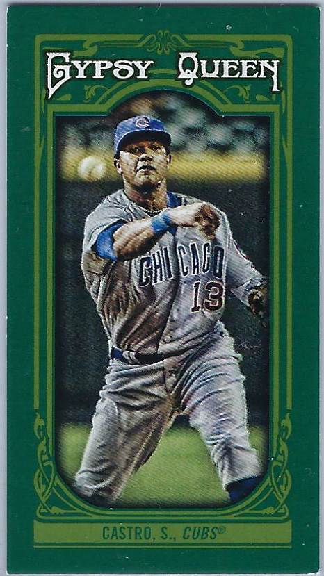
#4 2013 Topps Gypsy Queen Green Mini Parallel
I'm rarely nostalgic for the Topps Gypsy Queen minis and parallels, for they never stood out in comparison to the Allen & Ginter minis. With that being said, there are a handful of these cards in my collection that I cherish, one of them being this green parallel from 2013 GQ.

I'm indifferent towards the image on the front of this card; it's neither stellar nor lackluster. Rather, it's the full-bleed green on the front and back that sets this parallel apart from most other Gypsy Queen minis. 

The blurb about Castro on the back of this card highlights just how special of a player he was throughout his time with the Cubs. I've always been a huge fan of his and would like nothing better than to see him put up similar numbers in Miami.

#3 2012 Topps Gypsy Queen
If we're talking Chicago Cubs cards, you can never go wrong with the classic home uniform, especially with a beautiful shot of Wrigley Field's ivy or brick in the background. This card does exactly that while making fabulous use of the gorgeous 2012 Topps Gypsy Queen design.

The image is practically perfect for the 2012 GQ design. Better yet, every element of this card works beautifully with one another, resulting in a card that's so classic looking despite being only 7 years old.

#2 2014 Topps Stadium Club
Okay, there might be one Cubs uniform that looks even better than the traditional home jerseys. I'm not sure what this throwback uni is paying homage to, but I'm thrilled that Topps captured this stunning photo for the 2014 Stadium Club set.

Just like the 2012 Gypsy Queen base card, Castro's 2014 Stadium Club card combines a terrific uniform with Wrigley Field's ivy. With that being said, there are a couple things that I could do without.

The umpire doesn't really look like he belongs on this card, nor does the Under Armour advertisement in the background. Despite how unique this card is, it's evident that Stadium Club has become a more polished set over the last few years.

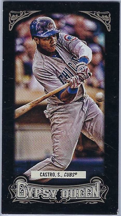
#1 2014 Topps Gypsy Queen Black Mini Parallel
Castro's 2014 Topps Gypsy Queen black mini parallel takes everything that I love about the green mini at #3 and ups the ante. The black fits perfectly with the Gypsy Queen set design, especially on the back of the card where black and white are the only colors present. You almost get a spooky feeling just looking at this card.

Furthermore, the photo on Castro's '14 GQ card is miles better (and clearer) than his 2013 mini. The action shot of the former Chicago Cub at the plate is something we don't usually see on his cards, but I appreciate that Topps included something a little outside the box.

Notice how this entire list featured cards of Castro on the Cubs and that the Yankees and Marlins were left out entirely. Starlin just hasn't had the same energy about him since he was traded away from Chicago, even though he's had respectable seasons with New York and Miami.

I really hope that he gets back on track to where he was earlier in his career and becomes a star once again for the Marlins. He's stuck on one of the worst teams in Baseball after being on 2 up and coming clubs, so he deserves all the success that he gets.

Friday, August 16, 2019

Moving Forward

Yesterday's frankenset post signified a change in my blog content. After 7 recap posts highlighting my pickups from The National, it's time to move forward with my collecting as we reach the middle of August.

At this point in the Baseball card collecting year, new products are being released left and right, but I'm trying to swear off buying cards until at least Labor Day when I might ease back into things with a trip to the show.

This is also the time, I've noticed, where the views and comments on my blog usually decrease. This is understandable since many people take their vacation around this time of year.

Since I've been so occupied with recapping The National, I haven't had any time to share what I've done across the 12 days that I've been back. 

 
For starters, I went to the Red Sox game on August 6th, my 2nd trip to Fenway Park this year. Though I had a memorable experience and amazing seats, the game, at least from a Red Sox fan's perspective, wasn't too great. The Sox lost to the Royals 6-2 in a matchup that Boston seemed destined to lose from the start.

Continuing with the theme of moving forward, I've used my free time over the last 12 days to do some serious organization in my Baseball card room. I started by simply putting the cards from The National away in their proper boxes and binders, but I have accomplished so much more since then.

I've created new binders, decluttered the card counter, purchased more empty boxes for extra storage, and taken better care of my oversized cards by keeping them in a binder together. 

Most significantly, I've completely reorganized my Red Sox and Cubs team PCs by giving them clean sheets, new binders, and changed the format of these collections so that the organizational system makes more sense. 

This brings me to the subject of today's post, a surprise package from Night Owl Cards that I received soon after I returned home from Chicago. This is actually my first look at the 2019 Topps Big League set, though I recognize the blue parallels from last year.

While the Bogaerts and Betts cards will go to their PCs, Eduardo Nunez's Big League parallel will fit perfectly in the new Boston Red Sox PC that I'm almost finished organizing.

Basically, the new system, in addition to providing new (much-needed) sheets, organizes the sets by brand, then by year, so all the Topps Flagship Red Sox sets are together in one binder which is where these 2 cards will be heading.

All the Bowman, Donruss, Fleer, Upper Deck, and any other sets that I can't think of right now are together as well and are chronologically organized. As for oddballs or sets that I only have 1 card from, those are together in a miscellaneous section of one of my binders.

A significant portion of this surprise package, however, consisted of set needs for 2015 Topps and its various insert sets. Night Owl has supplied me with a reasonable number of cards from this set over the last couple of years, so it stands to reason that most of what I'm missing is Dodgers base cards.

Thankfully, he covered that part of the set too and sent me enough Dodgers base cards to where I think it could be an entire team set. With all these Dodgers now in-hand, 110 cards are standing in my way of completing the greatest Topps Flagship set of the decade.

As you can see, I'm moving forward with my collection in many different ways following an unforgettable experience at my 2nd ever NSCC show. Similarly, the Boston Red Sox are trying to move forward despite an unexpectedly tumultuous year.

The starting pitching has been a huge disappointment for Boston this year, particularly former Cy Young award winner Rick Porcello, club ace Chris Sale, and, of course, their bullpen with an astounding 22 blown saves.

The Red Sox have the best offense in baseball, thanks in large part to Rafael Devers and Xander Bogaerts. While they haven't come close to playing at the level they did last year, there's still some hope of the Red Sox sneaking into the playoffs as a Wild Card team.

After all, things are different once October rolls around.

Thursday, August 15, 2019

Frankenset Page #60

Between my time at The National and the several recap posts that followed, it's been many weeks since I've done one of these frankenset posts. With just 13 pages left in the set (including this one), this series will be wrapping up shortly, meaning I have to think of what to do next.

Page 60 covers cards #532-540 in the set. This may be the most limited page yet as it only features cards from the 80s and 90s. With that in mind, let's begin.

#532 1983 Fleer Joe Rudi
This card should really be in my Joe Rudi PC instead, but I suppose I selected this card for the frankenset before I began collecting cards of the 3-time All-Star.

Until I checked his career stats on Baseball-Reference, I had no clue that Rudi was a 2-time runner-up for the AL MVP award. First in 1972 when he lost to Dick Allen and then in '74 when Jeff Burroughs took home the hardware.

#533 1985 Fleer Eric Davis
It's cool that my 2 favorite Fleer base designs are featured side by side at the beginning of this frankenset page. Both sets use a rather simple design and border-color but pair it with colorful uniforms. 

Although I have few cards from the set, '85 Fleer is my favorite of the 2 solely because of the silver borders. I can't imagine how cool it would be to look through pages of these cards together in a binder.

#534 1983 Topps John Butcher
I often find myself debating whether I prefer 1983 or 1984 Topps, the 2 greatest Flagship designs of the 1980s if you ask me. Unlike '83 and '85 Fleer, I haven't been able to decide on a favorite between the 2 Topps designs. 

Rather, I go back and forth a lot between the 2. Currently, I'm leaning more towards '84 because of how great of a job Topps did with that insert set in the Chrome release. Last year at this time, however, I likely saw '83 as the superior set.

#535 1989 Score Donnie Moore
I cannot, for the life of me, tell you why there are so many cards from 1989 Score in this frankenset. I either must've liked the set design when I was creating the frankenset (highly unlikely), or there were no other options for spots like #535.

Either way, I'm getting tired of seeing these cards, both in frankensets and across my card collecting room. I really need to put all of these in a box and never see them again.

#536 1986 Topps Jose Rijo
Some cards from 1986 Topps make me feel like it's one of the most underrated sets of the decade. The black banner with the colorful team name at the top has so much potential to be paired with all sorts of fun images.

Other times, the cards lack that wow factor, like the Jose Rijo card above. There's potential to do a lot more with the Athletics' team colors, but nothing was done to make this card stand out. 

My feelings about 1986 Topps are definitely mixed. The set, as a whole, had a lot of potential for some stellar cards, but that potential wasn't utilized across the entire checklist.

#537 1991 Topps Jose Lind
1991 Topps, on the other hand, is a prime example of making something out of nothing. Although the base design leaves a lot to be desired, Topps filled the checklist with innovative photography that we haven't really seen before or since (apart from modern-day Stadium Club).

In almost any other Flagship set, this would be another standard card of Pirates 2nd baseman Jose Lind. But in 1991 Topps, the photography is so creative that you can't help but take notice.

#538 1991 Topps Bip Roberts
I usually try to avoid showcasing 2 cards from the same set on 1 frankenset page, nevermind have them go back to back. But the Wrigley Field ivy on Bip Roberts' card made it so I couldn't deny this card a spot on the 60th page.

I could easily form a mini-collection of cards that feature Wrigley Field ivy in the background without including a single Cubs card. They seemed to be a lot more common in the 70s and 80s, but you still see the classic ivy in the backgrounds of Baseball cards today.

#539 1984 Topps George Frazier
I honestly didn't notice that there was a card from 1984 Topps on this page when I compared '83 and '84 Flagship sets earlier in this post. Although they're both fantastic designs, seeing them on the same page makes me believe that '84 is just a tad bit better.

These 2 set designs are similar in many ways, so it's challenging to choose one over the other. Nonetheless, the bold team name along the side of each 1984 Topps card is something that sets this set apart from the '83 design.

#540 1981 Topps Mike Schmidt
Though the green borders along with the red hat make me think more of Christmas than Baseball, Mike Schmidt's 1981 Topps card is classic, albeit simple. 

The Phillies uniform shown is one of my all-time favorites, and I love that Topps mentions that he was an All-Star at the top, something I believed they stopped doing in 1983. 

I may not be the biggest fan of '81 Topps, but I'll admit that there are some fabulous cards in this set, and Mike Schmidt's is definitely one of them.