
After the 1970s, fewer and fewer Topps Flagship sets had the impact that previous products had. The last 2 decades of Topps sets contained numerous standout products that remain well-loved and sought after to this day.
However, the 80s lacked those sets, not completely, but quite a bit. Ultimately, along with Fleer, Donruss, and Pinnacle beginning to produce their own sets, this commenced what we recognize today as the over-production and junk wax eras of Baseball cards.
My overall impression of 1980s Baseball cards is "average" which is not necessarily a bad thing. Simply put, it doesn't have as many memorable sets as other decades, and the iconic sets that it does have ('83, '84, and '87) are being over-represented by Topps throughout the 2010s, resulting in the Topps sets of the 80s coming off as rather lackluster.
The 80s fall right in the middle of the best decades for Topps sets since I know for sure the 90s were worse and the 2000s and 2010s are a toss-up when compared to this decade. I'm currently collecting 1 Topps set from the 80s and that would be 1983, one of my favorites from the entire decade.
Time to get started, beginning with a set that I was surprised ended up this low on the list, 1989 Topps.
#10 1989 Topps

Before I notice anything else, I'm instantly drawn to the unnecessarily large borders that take up a lot of the base cards of the 1989 Topps product. If you look at nearly any other set, you'll find very few products in which the borders are so thick all the way around the card, and I think that's part of why the 1989 Topps set doesn't appeal to me. Similar to 1978 Topps in terms of how minimal it is, the set appears incomplete, and the lack of originality is ultimately the sets' undoing.
#9 1986 Topps

1986 comes to my mind as one of the most average Topps sets of all-time, and it's unfortunate given that the base design had quite a bit of potential. However, the team name is far too large and takes up way more space than it needs to. Some sets, like '77 Topps, have pulled this off, but the drab set design that is 1986 Topps doesn't make the card or the huge team name any more appealing to the collector.
#8 1981 Topps

I know that 1981 Topps is a very well-loved product by many collectors, but I struggle to find what people see so appealing about the product. Don't get me wrong, it's far from bad, but there's nothing too special about this set aside from the hat with the position and team name on it. If not for the different colored caps, this set would attract attention for all the wrong reasons instead of for the things it does right.
#7 1980 Topps

Whenever I look at cards from 1980 Topps, I always get sucked in by the mini ribbons/banners right away. Despite the visual appeal, the more attention I pay to the set, the less interested I become in it. I will say that I'm very fond of the light blue card backs, and the banners don't get too boring throughout the 700+ card set thanks to different colors. However, the 80s still have some strong competition, and it's those other sets that pushed 1980 Topps all the way down to #7.
#6 1985 Topps

1985 Topps does an excellent job of utilizing all the space it has to create a detailed card that doesn't feel too cramped aside from the logo cutting off the team name just a bit. While the inclusion of the team's logo isn't needed, the border size on the base cards is pretty perfect. The green and red "Christmas backs" are very fitting for this time of year as well. Even though I barely have a dozen or 2 cards from this set, that total is enough for me to appreciate the product.
#5 1987 Topps

If not for Topps' desire to include 1987 Topps in numerous sets this year (minis from I believe 2012, last years' 3-series insert set), then I would've ranked this set a spot or 2 higher on the list. Unfortunuetely, the 2nd and final Flagship set with wood borders will have to settle for #5. The set still has numerous strong points, and it relies on more than just the wood to create some excellent cards. It's just a shame the set had to be so huge, taking away from the uniqueness of the cards.
#4 1988 Topps

Quite the opposite from 1987 Topps despite being the subsequent Flagship product, 1988 Topps is very underrepresented, having never been included as an insert set or even as part of the Topps Archives base set. I see the product as an attempt at what made the 70s so great for cards; different color combinations and solid pictures. It may not be able to stack up to the sets that the 70s put out, but by no means is 1988 Topps a poor effort.
#3 1984 Topps

Famous for the Don Mattingly rookie card, 1984 Topps was the final set that had the slightest bit of the 70s included within it. Bright and unique colors like pink and purple are used to write the team and player name while the set builds off what was successful the year before in 1983; using 2 images on 1 card. Everything also fits together very well throughout the product with nothing appearing out of place whatsoever.
#2 1982 Topps
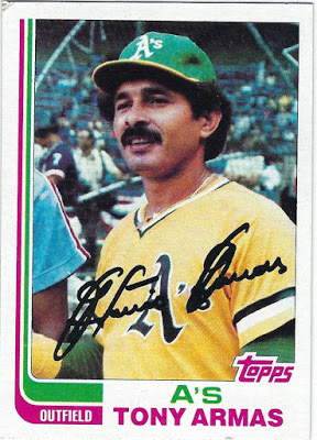
Even though it was represented in both 2013 and 2017 Topps Archives, 1982 Topps or the "Hockey stick set" features one of the most interesting designs I've ever seen. Each card consists of 2 colors in addition to the white borders and photo, a feature fairly rare with other sets that include logos or little color at all. For the A's, those 2 colors are pink and green, a crazy combination that, like nearly every other duo of colors, work very well together.
#1 1983 Topps

Despite their being a decent-sized lineup of above average sets, nothing comes close, in my opinion, to the near masterpiece that is 1983 Topps. The 2 photos on 1 card works better than it does in '84 Topps as well as the '63 set from 2 decades prior. Topps once again featured just 2 colors that, apart from the bottom of the card, appear in slim lines that don't take away from the rest ofthe set.
I like the way 2 colors are designed to connect the top part of the card to the bottom. If this wasn't carefully designed, the cards would seem like 2 different sets instead of 1. To their credit, Topps took a risk and it paid off, big time, with one of the best sets of all-time being the result.
No comments:
Post a Comment