Wednesday, July 25, 2018

Top 5 Cards: Willie Stargell

I don't mean to be one of those people, but I wish today's baseball was a little bit more like 70's baseball. Teams like the Athletics, Orioles, and Pirates stood out because of their generational players, colorful jerseys, and their nearly unparalleled ability to be interesting and talented teams.

Statistically, balls are being hit into play at a lower rate than they ever have been hit before. It seems like every hitter is either hitting a home run, striking out, or drawing a walk. Players like Willie Stargell, Ernie Banks, Willie Mays, Hank Aaron, and Roberto Clemente made for a close race for NL MVP every single year. However, these guys didn't just hit home runs. They would get key clutch hits, draw a walk when needed, drive in 100+ runs a year, all while maintaining a batting average around .280 or above.

The way that Willie Stargell played the game of baseball is what made him one of my favorite players in baseball history (likely top 15). This is also a reason as to why I collect cards of his and have a player collection of 75 cards strong. I had to pick out 5 of them for this list. Here are the cards I ended up choosing.

#5 2013 Topps Archives 1972 Topps Basketball
For the most part, I tried to limit this list to only vintage cards because of how well they represent the era Stargell played in and that I have a pretty decent number of vintage Stargell cards in general. However, I had to make an exception for the '72 Basketball insert from 2013 Topps Archives. Not only is the set very well recreated, but the photo choice and the blue background color could not have been better. The blue and yellow pairing has always worked on baseball cards, and this is no exception.

#4 1968 Topps
The first 100 or so cards in the 1968 Topps set featured a burlap much thicker than that used for the cards included in the rest of the set. That was the case for Willie Stargell's card #86 in the set. I must say that I don't prefer one burlap pattern to another, but I do like the color choice on this card just like the card at #5. As much as I like the light blue, Topps has always chosen the unconventional pink color for the Pirates in multiple sets (1965, 1966, 1968, and likely more). The picture chosen for the card is very good, especially for the 60's, and the jersey is the right one, not too colorful, for a set that already stands out on its own.

#3 1981 Topps
Stargell's 1981 Topps card consists primarily of 2 colors; those being gold and black. When you take the time to look at the entire card, you notice that more than 80% of the entire card is black and gold, the Pirates team colors. The all-gold Stargell jersey doesn't make it onto every card due to how much it pops, but I do think it works here. I may not be the biggest fan of 1981 Topps, but the black hat works well on this card. Now, if the border color was black just like the hat, this card could be one of the greatest cards in history.

#2 1973 Topps
I can't remember putting this many Topps Flagship cards in one top 5 cards post at any point since I started doing these posts on the blog. Maybe it's just me, but I seem to think that Willie Stargell's Topps base cards are a step-up from nearly any other player who played in that time period, and his 1973 Topps card is a testament to that. '73 Topps features a ton of landscape cards like this one. This shows Stargell in what I believe to be one of his first seasons at 1st base. You can see #17 for the Phillies running towards 1st base on this card. After looking up the number, I believe it's Terry Harmon included on this card as well.

#1 1966 Topps Buc Belters
Technically, this is the 4th Topps Flagship card included on this list despite not being a base card of Stargell. Instead, it's a combo card of Stargell and Donn Clendenon, a pairing we would again see included on a combo card in 1967 Topps. Not only does the pink look fantastic on this card, but Stargell and Clendenon are taking the exact same pose on this card, and that really makes for a well-done card. Plus, Topps deciding not to make this card Stargell and Clemente mean I'm able to have this card in my collection considering how expensive Clemente stuff is. So, I can obviously tell they knew what they were doing for this card which is why I chose it for the top spot.

Monday, July 23, 2018

The A&G Frankenset; My First Decisions

While gathering as many Allen & Ginter minis as I could last night, I discovered something. Even though I didn't have that many minis, all in all, there were still some instances where 1 spot would have 2 or even 3 options, forcing me to make some frankenset decisions very early on.

Like any frankenset, a major part of the A&G mini frankenset is going to be choosing between 2 or more cards. In these instances, I'd like to go with minis that aren't your standard mini card. I'd like variation backs, parallels, inserts, or even some non-baseball minis to make it into the set as a way to contrast all the base minis that will likely be taking up the majority of the pages. 

For instance, it would be difficult for a card to replace the Elvis Andrus black and white mini parallel at the top of the page unless it was some intriguing insert card. Not only is this mini a stand-out in particular, but the black and white border helps its cause.

Early on in the process, I've already been forced to make 3 decisions regarding certain spots in the frankenset. Those spots are cards #2, #9, and #12. Here are the choices and the decisions I made, starting with spot #2.

#SS-2 2016 Allen & Ginter Subways and Streetcars insert
This is one of the coolest Allen & Ginter insert sets I've ever seen, and it's a mini insert set as well. Though I do believe these would work better as regular cards, the concept behind the Subways and Streetcars insert set is very cool. Upon further inspection, I found it includes public transportation from other cities such as New York and San Francisco.
#USM-2 2016 Allen & Ginter U.S. Mayors
Like the Subways and Streetcars insert, the U.S. Mayors mini set includes mayors from all different United States cities. From Cleveland to Boston, over 30 different mayors are represented in this set with a blub on the back of the card describing what they've done as mayor of their city.

#2 2017 Allen & Ginter Albert Pujols
Despite being a regular base card mini, this Pujols card is a prime example of fantastic base card designs that also work exceptionally well as mini cards. Though it is more difficult for a card like this to be chosen over an oddball insert, the Pujols card makes a very good case for why it should be included in the set.

My Pick; Subways and Streetcars Red Line insert
There was certainly some steep competition at the #2 spot with 3 different cards each appealing to me in a different way. However, the uniqueness of the Subways and Streetcars insert combined with the interesting description on the back makes for the best overall option. After all, it is the 2nd card which plays a big role in keeping the frankenset interesting after following whichever card I choose for #1.

Next, here were the 2 choices for spot #9.

#C-9 2017 Allen & Ginter Constellations
Another one of my favorite A&G inserts, the constellations set is an insert set of 10 different constellations such as Orion, Libra, and the Aquarius constellation shown above. The front of the card includes an outline of the star formation in white which is very challenging to see and, to my knowledge, is not glow-in-the-dark which I learned as soon as I pulled the card. I'm not entirely sure, however, but I do know that this would be an excellent fit at #9.

#9 2017 Allen & Ginter Ryan Schimpf A&G back
Despite being a slightly rare A&G back mini, there's not much to get excited about over this 2017 Allen & Ginter Ryan Schimpf card. For starters, it's rather difficult for me, or nearly any collector, to get excited over Padres cards. Additionally, it's not even like he's Wil Myers who happens to be relatively interesting. Nothing against Ryan Schimpf, but his card doesn't have the wow factor that the constellation mini has.

My Pick; Constellations Aquarius insert
I can't say this will always be true, but in this case; constellations are better than Padres cards. I believe these inserts are relatively rare because I haven't seen any pulled in all of the 2017 Topps Allen & Ginter box breaks that I've seen.

Finally, I had a closely-contested matchup between 2 cards for the #12 spot. Here they are.

#12 2016 Allen & Ginter Trevor Story
It's going to be pretty difficult to beat out this Trevor Story card from 2016 Allen & Ginter that features some of the best background art I've ever seen on an A&G card. Additionally, I also said that I wanted this card in the frankenset no matter what, but it does all depend on the other card #12.

#12 2017 Allen & Ginter Corey Bellemore black and white parallel
I showed this card of the famous beer mile runner Corey Bellemore last night while explaining my predicament regarding non-baseball minis making it into the set. The best thing this card has going for it is that it's a black and white parallel which happened to look fantastic in the 2017 Allen & Ginter set, a big improvement over the well-designed yet minimal black and white parallels from the 2016 set as shown above.

My Pick; 2016 Allen & Ginter Trevor Story
This was probably the closest decision I've had to make out of the 3, but the gorgeous background on the Trevor Story card cannot be ignored. Even though I did want to incorporate some non-baseball cards as well as mini parallels, I didn't want to pass up on some of the most amazing minis I've ever seen which is why I went with Story at #12.

Please let me know if you have A&G minis to trade. I'd gladly set up a trade with you over the next week or so before I eventually head to Cleveland to hopefully add to the frankenset there as well. 

Sunday, July 22, 2018

Allen & Ginter Frankenset; A Concept

Unlike most every other card collector, I've never really been a huge fan of the mini cards from the Topps Allen & Ginter set. 

I'm not too sure what it is, but they've never really been something I've sought after or been all that interested in them. Maybe it's that they tend to fall out of the pack or can be easily misplaced. I realize they've been the most recognizable part of the brand since it was first released in 2006, so I guess I've just never quite known what to do with them.

I know that Night Owl has a mini frankenset of his own, and I'm sure there are a few more out there that I'm missing. After realizing that I intend to purchase at least a blaster of A&G this year, I discovered that I don't want to have these mini cards scattered everywhere. I want a place for all my A&G minis along with a new project to take on. However, what's good about this project is that I don't have to go too crazy with it. It can be more of a steady project rather than one I attempt to put together all at once.

To get started and see if this is something I'd like to expand on, I looked through the minis I had in my 2017 Allen & Ginter hobby box. Immediately, I had questions which I quickly realized needed to be answered before I started the frankenset. But first, here are some of the cards I found.

I first began seriously collecting Allen & Ginter back in 2016 when I purchased a box of the set for myself on my birthday. In fact, I don't think I had opened a single pack of the product until that day. I liked the base design alright, but I remember being a huge fan of the different colors in the background and the Numbers Game inserts from the 2016 set. I can't recall thinking too much of the minis. I decided not to separate any for player collections because of how small they were and how much they'd move around in standard sheets or sleeves, so I just left them in the box. In 2017 I did the same, hence why the Pujols mini isn't in the Pujols PC.

I originally had intentions of selling mini variations like the A&G mini back Ian Desmond card above, but I like this option more. Even though I like making money from when I sell cards, there's not much fun to it. I prefer finding a new purpose for a card or group of cards rather than simply listing them on Sportlots. I guess that's part of why this Allen & Ginter mini frankenset idea appeals to me. It gives a purpose to cards that, otherwise, could simply be sold or ignored. 

Now that I've talked a little about what I found, here come the questions. First, what should I do about the non-baseball cards? I get that the non-baseball and even non-sport figures are a big part of Allen & Ginter, but I'm not quite sure if I want these guys in my frankenset. Guys like Stephen A Smith could wind up in the set because I know and recognize who they are. However, guys like Corey Bellemore might not hold a spot for long if another card comes along. Still, the black and white parallel gives Bellemore some points to stay in the set.

My next question pertains to how large the set should be. Personally, I think either 300 or 350 is a good number. A 300-card frankenset would match up to what the average size of an Allen & Ginter set is while a 350-card set would include the short-prints like the Tim Raines and Whitey Ford cards shown above. I must say that I'm leaning more towards 350 just so I can have a place for cards like these. Plus, I'll take any chance I get to put an Expos card in a frankenset, even if it has a yellow color background that does not work well at all.

Finally, I'm not exactly sure what to do with mini inserts. Granted, the mini insert sets aren't too big so they wouldn't stretch out over the whole frankenset. However, the first 25 cards or so would be absolutely swamped with these mini inserts which may or may not be good. Don't get me wrong, I like the mini inserts they include, especially the dude cards, but I don't know if that's all I want to see for the first few pages. So, I suppose I'll have to do what is done for every frankenset. I'll have to make decisions between 2 or more cards regarding which one will make or stay in the set.

Even though I don't have all the kinks ironed out and I have absolutely no clue how many A&G minis I have, I think this will be a fun project to mildly pursue. Like I said before, this isn't something I have to go all-in for right now. Instead, I can take my time and add cards and make decisions when the time comes.

Friday, July 20, 2018

My Top 5 Allen & Ginter Sets

Undoubtedly one of the most interesting releases year after year, Allen & Ginter was released a couple of days ago on Wednesday. The 13th Allen & Ginter set features a unique set design similar to the uniqueness of last years' frame design. I guess they figured if the entire set was going to include white borders, they'd have to make the set more interesting than, say, the 2016 set above. 

Allen & Ginter has always been a set I've gone back and forth with. I like the concept along with the inclusion of retired players, something that not every set has nowadays. However, I can't say I'm too fond of the non-baseball cards in the base set. I understand the inserts, although I'm not jumping up and down to collect them, the base cards kind of ruin it for me. After all, I'm here for baseball cards, not non-sports cards.

In honor of the 2018 Topps Allen & Ginter, a set I will eventually find cards from at the National, I've decided to rank my top 5 favorite Allen & Ginter sets of all-time. 

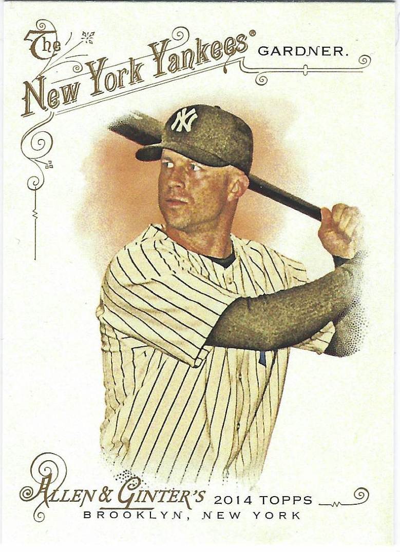
#5 2014 Allen & Ginter
The more simplistic 2014 Allen & Ginter set designs allows for something that not many other A&G sets have. The ability to use more interesting images that take up more space than the standard and common headshot found on many A&G cards. I do realize just how simple it is, but I must say I am a fan of it. For starters, I like the font used for the team name along with the little details included around it. Also, while I'm not a fan of Topps forcing their brand name on every card, I do like the way they do it here. By using a well-chosen font and including the city where Topps originates, Brooklyn, near the set name at the bottom.

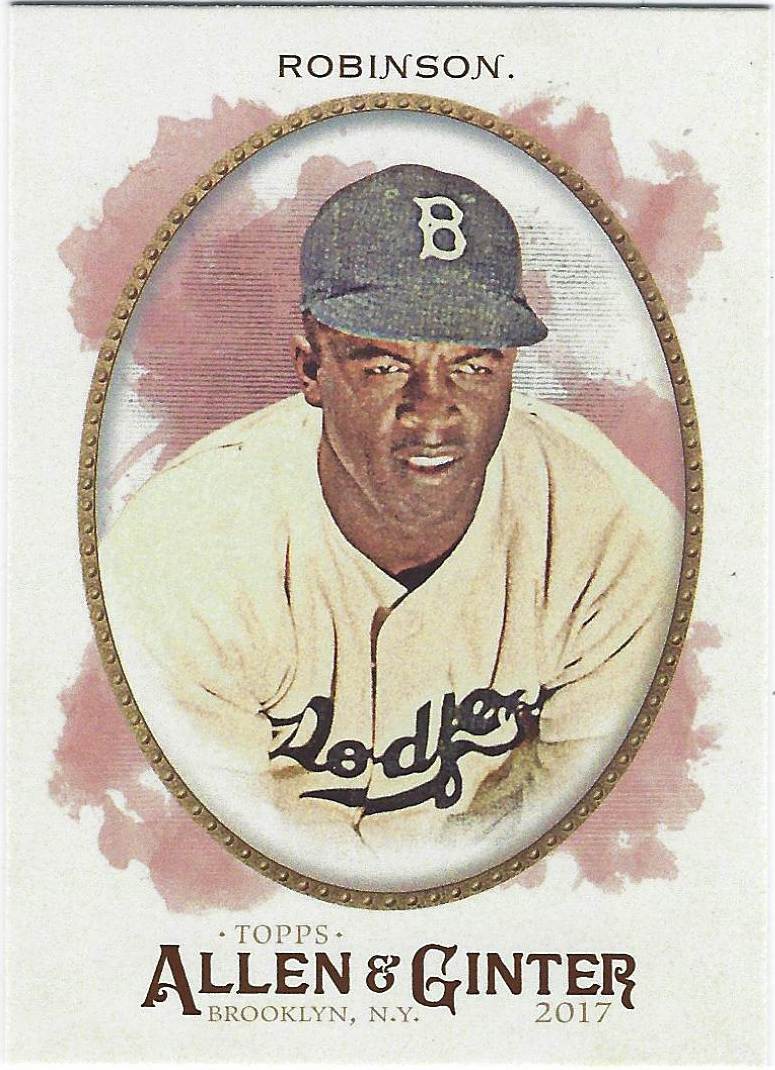
#4 2017 Allen & Ginter
As I said at the beginning of this post, Allen & Ginter has consisted of more exciting set designs as of late. The intriguing 2018 set design and the frames included in the 2017 set helped me get more into the Allen & Ginter set after the 2015 and 2016 sets which did little to excite me. The frames also take up just the right amount of space, so that not every single card is the same. The fonts are nice, the frames are a perfect fit. Everything about this set blends together awfully well.

#3 2006 Allen & Ginter
I'm not one of those people who gets too into the "first" of something. I know a lot of people are big fans of the first of something ever made, like the first Topps set in 1952. However, I have to make an exception for 2006 Allen & Ginter, the first set in brand history. The base design is incredibly minimal, probably the most minimal set I've seen that I still like. I must say how much I love the color choices of the set such as the green shown above, the sky blue, and even the yellow. Sometimes the yellow, but definitely not always.

#2 2011 Allen & Ginter
This may be a bit of an oddball pick, but I'm really such a huge fan of the 2011 Topps Allen & Ginter set design. The main part that draws my eye in a very positive way is the bottom of the card. The various designs around the team logo and the Allen & Ginter name are well-designed and include colors that work exceptionally well together. While the image quality certainly could be better, this set has way more things going right for it than it has things going wrong. It definitely conveys a strong attention to detail at the hands of whoever designed the set, and that's something I truly appreciate.

#1 2012 Allen & Ginter
One of the greatest examples of a set with such a minimal design becoming such a fantastic product is my favorite Allen & Ginter set ever made, the 2012 set design. The border design takes on an ancient feel as I believe the sides are supposed to be pillars, and the bottom of the design helps the Allen & Ginter name appear like it belongs on the card. While all of this is happening, the photo of the player is positioned perfectly with a ton of space for action images, headshots, or anything else you may want. While other A&G sets either have a good set design or good images, 2012 Topps Allen & Ginter has both. That's why it ended up as my favorite Allen & Ginter set of all-time.