
I initially had zero plans to recap or give my thoughts on the 2019 Panini Donruss product, but I've witnessed a few different bloggers share their opinions on the set over the last few days. Alas, I figured I'd join the party and summarize the set in a nutshell based on the blaster box that I opened last month.
2019 is the 6th straight year that Panini has released their revived attempt at the Donruss brand, and it's become increasingly difficult to tell the difference between the set designs. I will say that this year's design has a bit more personality, and I'm fond of the throwback-style Donruss logo in the top left corner.
The no-logos almost go hand-in-hand with Panini products, and I've honestly grown accustomed to the absence of team names and logos. Truth be told, my main problem with Panini Donruss has never been the fact that Panini doesn't have the MLB license. Rather, I have issues with the product itself.
As I alluded to earlier, I purchased a blaster box of 2019 Panini Donruss last month, a decision that didn't seem right from the start. There's far more value, oddly enough, in the value packs rather than the blaster box.
I could've gotten far more cards for the same price had I bought 4 value packs instead, but the promise of 8 exclusive parallels in the blaster appealed to me, so I bit the bullet and tested my luck in an effort to sample what this product has to offer.

The set design is probably the best that we've ever seen from this product, but that's not saying all too much. It's more of a modern take than what we've seen in the past, thanks to the diagonals in the top left and bottom righthand corners, but the respective team colors are still profoundly featured.
I realize that Panini can only use the city name, but I'm struggling to understand the reasoning behind the faded city name and position at the bottom of the card. If Panini can't mention the actual team name, the least they can do is make the city name and player's position a bit more noticeable.

Like the 2018 release, this year's Panini Donruss set is variation-centric as they tend to fall at roughly 1 per pack. However, unlike the helpful hint (white baseball vs black baseball) that indicate which cards are variations in 2018, no such indication exists on this year's card backs.
Because of that, I've been relying on the COMC set checklist when adding some of these cards to my online PC inventories. Cards that seem like regular base cards, as it turns out, are actually variations.
All it would take is a subtle change, but I wish that Panini would've done something similar to what they did in 2018 as it pertains to distinguishing the variations from regular base cards.

Card backs have always been a major weakness of Panini, but I actually like the ones from this year. The orange/yellow color is reminiscent of the card backs from the classics cards in the 2018 Chronicles set.
As always, Panini could have utilized the space much better, and I spot a couple of places in which they could include a little detail to separate base cards from variations.


This year's Diamond Kings cards are in the style of the 1985 Donruss set as Panini continues to recreate the Donruss base sets from the 80s as part of their product, beginning with the inaugural release in 1981.
The '85 Donruss set is extremely underrated, for it makes excellent use of black borders which can be a daunting task. While Panini did a stellar job with these cards, the card backs could very well be some of the worst that I've ever seen in my life.

Starting in, I believe, 2015, Panini made an effort to recreate previous Donruss base set designs initially released in the 1980s. This year, it's 1985's turn, meaning we finally get to see black borders on Baseball cards once more.
While they weren't perfect in recreating the set, I do appreciate the effort and, nevertheless, I really do cherish these cards. I didn't end up with any major names, or, come to think of it, any guys that I collect, but I included a few of the nicer ones above.
Even though this year's rookie class isn't too strong, 90% of the '85 cards that I pulled were rookies, including 2 different ones of the same player, the April 2019 AL Rookie of the Month, Brandon Lowe.

As promised, I received 1 8-card pack of blaster box exclusive parallels. However, I soon noticed that there were 2 different types of parallels featured in the pack. I won't go over each and every card that I pulled, but I will give an overview and show the highlights.
The first type was a holo purple parallel, a cross between the rainbow foil cards of Series 1 and a traditional parallel card. I pulled 4 of these but didn't end up with anything notable.
The highlight was likely an '85 card of a player I can't seem to remember more so because of how much I like the '85 cards rather than how cool the purple parallels are.
It's not that I dislike the purple foil parallels. Rather, I just didn't end up with any cool cards. The 2nd group of exclusive cards, the rapture parallels, were definitely my favorites.

From the moment when I first laid eyes on these distinctive rapture parallels, I was incredibly impressed. Here, there are a creative and interesting group of parallels available as a retail exclusive that totally distracts me from the fact that these cards have no logos.
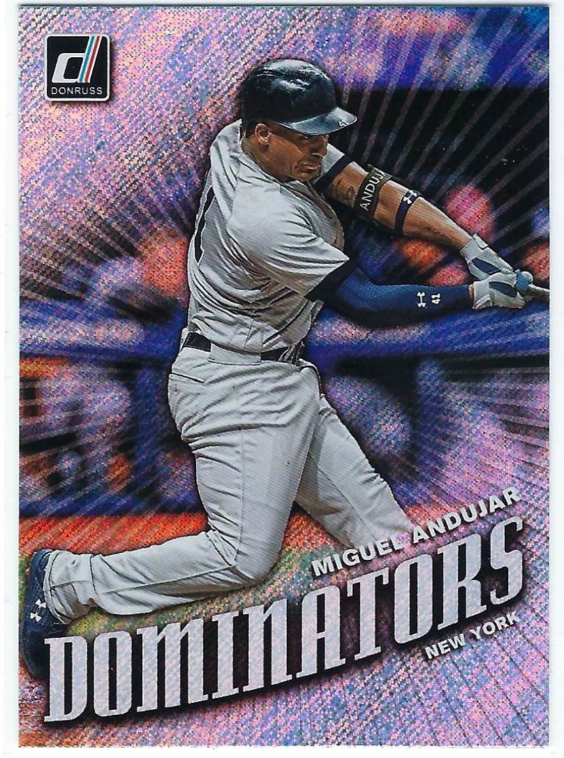
I'm not sure if these rapture parallels exist for base cards in addition to inserts, but the 4 cards that I pulled were all some sort of insert card. The Dominators of Miguel Andujar is perfect for the parallel while the Kershaw is an excellent PC addition.

However, it was the Juan Soto Nicknames card that gets my vote for not only my favorite parallel but the best card of the entire blaster box. Because I opened the exclusive parallel pack first, the Soto insert parallel was the very first card I pulled.
From that moment on, nothing else could match this colorful, inovative, and interesting card. I guess that's part of the reason why some elements of this product disappointed me; it started off on such a high after I pulled the Soto card.
All in all, I wouldn't rule out 2019 Panini Donruss entirely. There are some fabulous elements, like the 1985 cards and these funky parallels, but Panini missed several opportunities to make this set more user-friendly.
I fully expect to see 2019 Panini Donruss in the dime bins for months and even years to come, and I won't stay from it completely.
I'll just have to remember to check every single card that I buy online to see if it's some sort of variation or not.
It's funny - I went over the Donruss set on my blog yesterday, and lamented the choice of using "Juanjo" as Soto's nickname variation card. I thought "Childish Bambino" was much cooler, and I'm glad to see it at least made it on an insert.
ReplyDeleteThe base set design is starting to grow on me... but I'm all about those logos... so I don't think I'll ever go out of my way to pick up a box or anything.
ReplyDelete