Showing posts with label ranking Topps sets by decade. Show all posts

Friday, January 4, 2019

Ranking Topps Sets by Decade; 2010s

The time has finally come. I have officially reached the final part of my ranking Topps sets by decade series that I started a couple of weeks ago. Today, I have finally arrived at the 2010s.

With 2019 Topps Flagship set to be released at the end of January, we're soon to have another decade of Topps Flagship sets completely in the books. Thus, it's become time to access the entire time period as to the quality of Topps Flagship products that it has released.

Truthfully, the 2010s have produced some of the worst Topps sets of all-time. However, we've also seen some brilliant Topps sets developed in this decade as well.

Unfortunately, the endless modernizing of their products, large sets, and poor designs tend to outweigh some of the better sets from this decade. Plus, we still haven't seen 2019 Topps in-hand yet so my opinion could alter slightly after this set is released.

Speaking of 2019 Topps, I've decided to leave the set off the list for the very reason I listed above; we haven't seen the cards in-person yet. We don't know what the card backs look like nor do we have a sense of what cards will look like for different players and teams. 

I can always add 2019 Topps onto this list a month or so from now, but for the time being, it's best that I leave it off and stick to the 9 sets released so far this decade.

#9 2012 Topps
An unfinished mess with too much foil is the best way I can describe 2012 Topps. It's truly one of the worst Topps sets I've ever seen. Yes, even worse than the disaster that was 2016. While 2016 at least had a complete design, 2012 Topps has a little oval in the bottom left corner and that's it. The foil circles around it don't make much sense and the bland photography takes up way too much space. Even a minor detail, the rookie cup trophies, are too small. There's really not a whole lot to like about this set.

#8 2016 Topps
When there's smoke, there's fire, and when you have some smoke and cut-off logos, the result is an infamously bad Topps Flagship design. Both the top right and bottom lefthand corners are filled with smoke not to mention the box that has the player's name as well. But if that wasn't enough, Topps felt the need to cut-off every team's logo, leading to one of the most frustrating and mindboggling sets in Baseball card history.

#7 2010 Topps
Unnecessarily big team names and not much else is the way I'd describe 2010 Topps which, up until today, I didn't even know included the players' position in tiny text in the bottom left corner. In addition to foil names (ugh), the set features gigantic logos that take up far too much space. I don't think Topps could do anything to this set to make it more interesting, so they just created the most mediocre and unmemorable set possible, and it worked.

#6 2014 Topps
2014 Topps is just so harmless that I felt obligated to place it towards the middle since it's neither a great set nor a terrible product. With the white borders, the team logo, and small bits of color throughout the card, 2014 Topps manages to blend in with all the other 2010s products. It's still not that great of a set, but there are far worse and far better products out there.

#5 2013 Topps
Although it came before 2014 Topps, the 2013 set is almost an upgraded version of the subsequent product. With simple and well-executed card backs and a clean front, 2013 Topps is a nice product by 2010s standards. There's just the right amount of color, though I could always go for more, and the logo takes up just the right amount of space. Take notes, 2010 Topps.

#4 2017 Topps
Call me a villain, but I don't think 2017 Topps was all that bad. The slanted silver design wasn't my favorite feature, and I still miss borders, but at least we had improvement from 2016 Topps. Overall, I really like the sleekness of the silver and wish it took up more space and wasn't slanted at such an angle. There are no cut-off logos, everything is the right size, and cards like the Mookie Betts one above feature some eye-catching photography across the entire set.

#3 2018 Topps
Despite my feelings about 2017 Topps, neither it nor 2016 were that well-received. It took one of the simplest sets in Topps history before a Topps Flagship set was declared to be a nice looking product. That set was 2018 Topps, and it finally proved that Topps could pull off a respectable, borderless Flagship product. 

The pictures are great, but the detail I like the most is the little slide that holds the logo at the bottom of the card. It does a nice job of complimenting the team colors as do the bars with the player name, position, and team name as well.

#2 2011 Topps
If you spotted an image like the one on the Joe Mauer card above in a Topps Stadium Club set, you'd be impressed, big time. For whatever reason, 2011 Topps was like its own Stadium Club product with fantastic images spread out throughout the entire set, including unique photos that you don't usually see in a Flagship set. The base set design is also pretty well-done, but the main thing to take from 2011 Topps remains the fabulous photo quality.

#1 2015 Topps
While I was forming the final list, I gave no second thought to which set would end up at #1. To me, it wasn't even a debate, 2015 is far and beyond the best set from not just the entire decade, but the 21st century as well. Finally, Topps listened to what we wanted, and after white-bordered average sets for quite some time, 2015 Topps came along and brought with it all the color you could ever ask for.

Moreover, the 2015 Topps Chrome set was one of the best in years with gorgeous chrome cards resulting from this Flagship design. I'm currently in the process of completing this set, and I can't wait to see how colorful the binder sheets will be when I finish it off.

Tuesday, January 1, 2019

Ranking Topps Sets by Decade; 2000s

To be quite honest, I don't really know what to think about the 2000s in terms of Topps Flagship sets. It has a couple of standout designs, but it's left somewhere in the middle in terms of the best and worst decades for Topps sets of all-time. The 2000s lack even that 1 set that helps them stick out, whether that's in a good way or a bad way.

Encompassing sets with nontraditional border colors like 2001 (green), 2002 (bronze) and 2007 (black), the 2000s departed from what Topps had done for decades before. However, most of the other sets utilized white borders, some of which worked, others did not.

More so than any other decade, many sets from the 2000s had the potential to be great, but the designs ended up falling short for whatever reason. 

Throughout this in-depth look, I'll be pointing out what sets fell short and why, along with the products that missed the mark almost entirely, and finally, the few sets that rose to the top of the entire decade of Flagship designs.

#10 2005 Topps
Large amounts of foil have rarely worked out well in a Topps Flagship design, and 2005 Topps is a perfect example of this premise. Even without the foil near the team name at the bottom of the card, there's another major problem with this card; there's a lot of repetition. The team name is listed twice and with the players' last name appearing 2 times as well, 2005 Topps embodies what a modern set looks like when it goes wrong.

#9 2004 Topps
Probably the most forgettable Topps Flagship set ever released, 2004 Topps seems to take elements that we've seen from multiple different products without doing much on its own. I recall being somewhat fond of the set in the past, but the more I think about it, the more I realize that the set isn't anything special.

Even the position player in the bottom left corner is something we've seen before (1976 Topps), and that seems to be one of the only details differentiating this set from any other Topps Flagship product from the last 15 years.

#8 2003 Topps
Bless their hearts for using non-white borders in a few Topps Flagship sets from this decade, but in some instances, I get sick of seeing the same color over and over again, especially in a 721-card set like 2003 Topps. 

Something about the dark blue color just doesn't work on Baseball cards, leaving a dissatisified taste in my mouth when I look at the set. I respect Topps' attempt to pay homage to previous sets like '83 with the 2nd photo on the card, but like the blue borders, it simply doesn't work.

#7 2006 Topps
The photo quality of the 2006 Topps set saved it from finishing much lower on the list, for the set design is nothing exciting whatsoever. It features more foil (ugh) and different colors depending on what team is shown on the card. But because of the number of teams with red and blue team colors, many of the cards feature red and blue stripes along the top and bottom of every card.

It's not just the Victor Martinez card. There are numerous examples of superb photography throughout the set. While the photos couldn't save the set completely, it sure did have an effect on 2006 Topps' placement on the list.


#6 2001 Topps
This greenish-blue shade is slightly easier to look at than the bold blue of the 2003 set, but the 2001 Topps product did not do justice for the 50th anniversary of the first Topps set back in 1951. Judging by the 2015 Bowman set, I assume that Topps still hasn't learned to make all player names legible as is shown here with a rather difficult to read font, spelling out "Fernando Tatis."

I actually don't mind the color at all, but there weren't enough strong points for this set to make it higher on the list than the #6 spot.

#5 2000 Topps
Topps ushered in a new millennium with a sleek Flagship design, composed of light grey borders and the slightest bit of color at the bottom of the card. While I like the balance between the amount of space the photo takes up and the splash of color, I'm still not a fan of foil text on Baseball cards, and all the info spelled out at the bottom of this card in foil lettering is almost impossible to read when scanned.

#4 2009 Topps
I surprised myself with how high I placed 2009 Topps on this list, but the reality is that even though parts of the set don't work, the design, as a whole, is actually pretty nice and comes together rather well. The logo placement on home plate is a nice touch along with the black space behind the foil. IF Topps is going to insist on using foil letters, I'm glad it's at least somewhat readable.

It's almost as if Topps remade the horrendous 1994 Topps set with a modern twist. Gone are the ugly colors and weird features, and in their place, we have a sleek design that symbolizes what the 2000s are capable of producing.

#3 2007 Topps
The idea behind 2007 Topps is enough to put it at the #1 spot, but even though it didn't make it to the top, the '07 Flagship design is one of the boldest sets Topps has attempted in the last number of decades. 

One of only 2 black-bordered sets ever created, 2007 Topps is accompanied by respectable images that help further enhance the product. If not for odd pattern designs in every corner and a missed opportunity for a unique colored font for the players' name, 2007 Topps could be the greatest Flagship set of the 21st century.

#2 2002 Topps
Out of all the choices for border colors across the 2000s, the bronze borders of 2002 Topps seemed to be the best of the bunch, and that's the main reason why 2002 Topps has ended up as the runner-up on this countdown. In addition to featuring a wide variety of images, 2002 Topps remains a standout because of how well Topps pulled off the bronze border design. 

In some places, specifically the bottom left, there's a bit too much border on the card and not enough of the image or the ribbon. However, there are only a couple of small drawbacks in what has become a Flagship set that I'm increasingly fond of.

#1 2008 Topps
Topps had a world of potential when creating the 2008 Flagship set, and what they were able to pull off exceeded what I thought was possible from a 2000s set; white borders with just the right amount of color and excellent images.

Unlike a set like 2006 Topps, the colors that spell out the team name change frequently, and the foil for the player name, in this instance, is by far the most legible of the entire decade. I could certainly do without the facsimile signatures, but that's the only major complaint that I have. 

In a decade that lacked standout products, 2008 Topps stood out at an entirely different level.

Saturday, December 29, 2018

Ranking Topps Sets by Decade; 1990s

We've now reached the decade that I've dreaded analyzing each set from, mainly because of how unfamiliar I am with the lackluster Topps sets from the 1990s.

I have a solid knowledge of some of the better sets from the 90s, specifically from 1990-1993. However, the last number of sets from the decade often blend together, leaving me unable to distinguish, for example, 1996 Topps from 1998.

It doesn't help that this was right in the middle of the junk wax era, a time in which Topps' popularity hit an all-time low. The end of the 1990s saw very few memorable sets produced. 

Even today, I'd struggle to put together a stack of 25 or so cards from 1990s sets starting in 1995. That's how few Topps cards from the 90s have a place in my collection. They were never collected by my Dad or myself, and I have not once felt the need to rectify that.

After this post, I'll be able to move on to the 21st century with some lightly more promising decades, the 2000s and the 2010s. If you think some of today's sets are bad, try taking a trip back 20 years to the sets of the 1990s.

#10 1994 Topps
A mere few weeks ago, I ranked 1995 Topps, not 1994, as the worst Topps set not just from the 1990s, but all-time. While I haven't had a drastic change of heart, I have learned to appreciate 1995 Topps slightly more than '94, resulting in 1994 Topps winding up dead last on this list. 

Simply put, the set is all over the place. We have a barrage of bright colors, an unusual font for 90s cards, and a jagged edge near the bottom that looks more out of place than nearly anything I've seen on a Baseball card in my life.

#9 1995 Topps
I said I had a slight change of heart regarding 1995 Topps, not enough to catapult the set up many spaces on this list, however. It also wasn't enough for me to be able to find a different card from the set in my collection so Orland Merced will have to represent the set twice. 

I have a major problem with the borders around the images and how visually offputting they are. It almost looks like a big stack of 90s cards got stuck together and when you peeled one off the other, a bit of the card ripped off. Cards like 1995 Topps will do something like this naturally if not attended to, don't make it a feature of the entire set.

#8 1996 Topps
There's frankly nothing interesting about the 1996 Topps set whatsoever. In fact, there's one major annoying aspect, that being the use of the same exact image in 2 places on the card; once in the actual photo and another time in an unusual blue square at the bottom of the card by the player name. I can only imagine how bad some of these cards are in this set due to an unflattering photo being used not just one time, but 2 times on the card.

#7 1998 Topps
I had quite some trouble finding cards from both 1997 and 1998 Topps because of how uncommon these 2 sets are in my collection. I had to settle for 1998 Topps Chrome instead of Flagship, but that won't affect my views on the set. Overall, it's a pretty average product which can be viewed as both a good and bad thing given the other Flagship sets of the 90s. 

Unlike 1998 Topps Chrome, the base set has gold borders instead of silver which don't really work with the little bit of color going on at the bottom of the card.

#6 1999 Topps
While they were designing the 1999 Flagship set, I think Topps finally discovered what made the previous years of their sets so unappealing. Therefore, they created a set so minimal and basic that there's basically nothing besides a picture and a gold border. 

While such a boring product like this wouldn't be so well-received today, I think collectors were glad to have something decent from Topps after many years of disappointing sets. It reminds me a lot of 2018 Topps and how it was preceded by 2 pretty awul sets in 2016 and 2017 respectively.

#5 1997 Topps
I don't know if Topps was taking more of an old-school or a modern approach to their 1997 Flagship design, but the overall result was decent, at least as far as 90s sets go. There are a couple of different colors besides green across the set, and like 1999 Topps, it's a very basic product with nothing too crazy going on. It adds a refreshing splash of color which 1999 Topps does not do, so it was the '97 set that sneaked into the top 5 over '99.

#4 1992 Topps
The top 4 sets on this list are in a league of their own when compared to the bottom 6 sets. The first 4 years of this decade saw the top 4 sets produced. One of those set was 1992 Topps, an underrated product that got the attention it deserved when featured in 2017 Topps Archives. 

In addition to a respectable and modern base set design, 1992 Topps has one of my favorite card backs of all-time with a big Topps logo right in the middle of the back of the card.

#3 1993 Topps
Home of the iconic Derek Jeter rookie card, 1993 Topps takes the best parts of the 1992 set and completely modernizing it. With a new material used for the cardstock, 1993 Topps is a basic outline for many of the subsequent Topps products. 

The set featured high-quality photography, new cardstock, and just a splash of color, something Topps would rely on for decades to come. For better or worse, 1993 Topps was the beginning of a new era for Baseball cards.

#2 1990 Topps
The motto "less is more" certainly could never be applied to the 1990 Topps set with one of the most colorful and vibrant products in Baseball history kicking off the 1990s decade. The borders, team name, and box around the player's name combine to add almost too much color to each and every card. 

I think Topps was trying for one last nod to what made the 70s so great; colorful and fun cards. It might not have the same appeal as 70s sets, but years after it was produced, I've come to appreciate the 1990 Topps set.

#1 1991 Topps
While the top 4 sets on this list are definitely in a league of their own, 1991 Topps, without a doubt, reigns as Topps' finest effort across the entire decade. The product featured some of the most unique selection of photos I've seen in any Baseball card set, and the set design is a perfect balance, allowing the star of the cards, the players, to stand out.

The card backs are great, the team names are done beautifully on the right-hand side of the card, and the set is overall quite appealing. Even with some dismal releases throughout this decade, 1991 Topps remains the bright spot that Topps needed.

Monday, December 24, 2018

Ranking Topps Sets by Decade; 1980s

After the 1970s, fewer and fewer Topps Flagship sets had the impact that previous products had. The last 2 decades of Topps sets contained numerous standout products that remain well-loved and sought after to this day. 

However, the 80s lacked those sets, not completely, but quite a bit. Ultimately, along with Fleer, Donruss, and Pinnacle beginning to produce their own sets, this commenced what we recognize today as the over-production and junk wax eras of Baseball cards.

My overall impression of 1980s Baseball cards is "average" which is not necessarily a bad thing. Simply put, it doesn't have as many memorable sets as other decades, and the iconic sets that it does have ('83, '84, and '87) are being over-represented by Topps throughout the 2010s, resulting in the Topps sets of the 80s coming off as rather lackluster.

The 80s fall right in the middle of the best decades for Topps sets since I know for sure the 90s were worse and the 2000s and 2010s are a toss-up when compared to this decade. I'm currently collecting 1 Topps set from the 80s and that would be 1983, one of my favorites from the entire decade. 

Time to get started, beginning with a set that I was surprised ended up this low on the list, 1989 Topps.

#10 1989 Topps
Before I notice anything else, I'm instantly drawn to the unnecessarily large borders that take up a lot of the base cards of the 1989 Topps product. If you look at nearly any other set, you'll find very few products in which the borders are so thick all the way around the card, and I think that's part of why the 1989 Topps set doesn't appeal to me. Similar to 1978 Topps in terms of how minimal it is, the set appears incomplete, and the lack of originality is ultimately the sets' undoing.

#9 1986 Topps
1986 comes to my mind as one of the most average Topps sets of all-time, and it's unfortunate given that the base design had quite a bit of potential. However, the team name is far too large and takes up way more space than it needs to. Some sets, like '77 Topps, have pulled this off, but the drab set design that is 1986 Topps doesn't make the card or the huge team name any more appealing to the collector.

#8 1981 Topps
I know that 1981 Topps is a very well-loved product by many collectors, but I struggle to find what people see so appealing about the product. Don't get me wrong, it's far from bad, but there's nothing too special about this set aside from the hat with the position and team name on it. If not for the different colored caps, this set would attract attention for all the wrong reasons instead of for the things it does right.

#7 1980 Topps
Whenever I look at cards from 1980 Topps, I always get sucked in by the mini ribbons/banners right away. Despite the visual appeal, the more attention I pay to the set, the less interested I become in it. I will say that I'm very fond of the light blue card backs, and the banners don't get too boring throughout the 700+ card set thanks to different colors. However, the 80s still have some strong competition, and it's those other sets that pushed 1980 Topps all the way down to #7.

#6 1985 Topps
1985 Topps does an excellent job of utilizing all the space it has to create a detailed card that doesn't feel too cramped aside from the logo cutting off the team name just a bit. While the inclusion of the team's logo isn't needed, the border size on the base cards is pretty perfect. The green and red "Christmas backs" are very fitting for this time of year as well. Even though I barely have a dozen or 2 cards from this set, that total is enough for me to appreciate the product.

#5 1987 Topps
If not for Topps' desire to include 1987 Topps in numerous sets this year (minis from I believe 2012, last years' 3-series insert set), then I would've ranked this set a spot or 2 higher on the list. Unfortunuetely, the 2nd and final Flagship set with wood borders will have to settle for #5. The set still has numerous strong points, and it relies on more than just the wood to create some excellent cards. It's just a shame the set had to be so huge, taking away from the uniqueness of the cards.

#4 1988 Topps
Quite the opposite from 1987 Topps despite being the subsequent Flagship product, 1988 Topps is very underrepresented, having never been included as an insert set or even as part of the Topps Archives base set. I see the product as an attempt at what made the 70s so great for cards; different color combinations and solid pictures. It may not be able to stack up to the sets that the 70s put out, but by no means is 1988 Topps a poor effort.

#3 1984 Topps
Famous for the Don Mattingly rookie card, 1984 Topps was the final set that had the slightest bit of the 70s included within it. Bright and unique colors like pink and purple are used to write the team and player name while the set builds off what was successful the year before in 1983; using 2 images on 1 card. Everything also fits together very well throughout the product with nothing appearing out of place whatsoever.

#2 1982 Topps
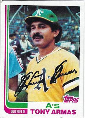
Even though it was represented in both 2013 and 2017 Topps Archives, 1982 Topps or the "Hockey stick set" features one of the most interesting designs I've ever seen. Each card consists of 2 colors in addition to the white borders and photo, a feature fairly rare with other sets that include logos or little color at all. For the A's, those 2 colors are pink and green, a crazy combination that, like nearly every other duo of colors, work very well together.

#1 1983 Topps
Despite their being a decent-sized lineup of above average sets, nothing comes close, in my opinion, to the near masterpiece that is 1983 Topps. The 2 photos on 1 card works better than it does in '84 Topps as well as the '63 set from 2 decades prior. Topps once again featured just 2 colors that, apart from the bottom of the card, appear in slim lines that don't take away from the rest ofthe set.

I like the way 2 colors are designed to connect the top part of the card to the bottom. If this wasn't carefully designed, the cards would seem like 2 different sets instead of 1. To their credit, Topps took a risk and it paid off, big time, with one of the best sets of all-time being the result.

Sunday, December 23, 2018

Ranking Topps Sets by Decade; 1970s

I've now reached the golden age in terms of Baseball cards, the 1970s. In addition to numerous memorable Topps sets, Kellogg's made a name for themselves and their iconic 3D card sets throughout this decade as well. I've already completed 2 Topps sets from this decade (1972 and 1975) and am currently piecing together 2 others (1976 and 1979).

Even with the 1970s containing more well-designed sets than nearly any other decade, I was able to decide the order for this list fairly quickly. There are a couple of so-so sets, a few incredible products, and finally, 3 sets or so that will go down in history as some of Topps' best efforts.

Additionally, one of the main themes of the 1970s, not just for Baseball cards, was the wide range of bright and bold colors. Each and every set makes an effort to include different colors depending on the team with some sets, like 1975 and 1976, having more color than others. 

Sets like 1970 and 1971, on the other hand, feature recognizable silver and black borders respectively.

#10 1978 Topps
1978 Topps appears to be the only set that doesn't fit in with the rest of the 1970s set, mainly due to is sub-par set design and its inability to excite collectors. Don't get me wrong, there are still plenty of well-executed cards within the set, and the card backs are fairly strong. However, an image with a white border and a cursive font do little to amaze me given what else is available from this era.

#9 1974 Topps
It's not that the 1974 Topps set has the worst set design of the 70s, that would be 1973, but this set, in addition to 1978, does little to stand out. With nearly every set across the 70s decade being a winner in one way or another, each set is in need of 1 particular factor that sets it over the edge. While it's a respectable all-around set, 1974 Topps doesn't necessarily have that "it" factor to set it over the edge.

#8 1973 Topps
If not for the abundance of awesome images and a wide variety of different angles for said photos, 1973 Topps would end up dead last on this countdown. No matter how much I try, I can't get behind such an uninteresting set design, no matter how intriguing the images are. However, the top tier photos do their part to elevate the 1973 Topps set, a product that would be lost without cards like the Ed Acosta card above.

#7 1979 Topps
Just like 1960 Topps seems to fit in better with the 1950s Topps sets rather than the 60s, 1979 Topps has more of a 1980s style rather than a 70s base set design. As you can tell, Topps began to shy away from using too much color towards the end of the 70s, the exact opposite of what they did in sets like 1975 Topps. My favorite part of this set is easily the old-school Topps logo placed on the Baseball in the bottom left corner. 

#6 1977 Topps
As we saw in this years' Topps Archives set, 1977 Topps is certainly an above-average product with big, colorful team names in addition to a variety of different photos. However, in a decade like the 1970s, simply an above average set doesn't get you much higher than 6th on the list, a testament to how strong the decade remains, even to this day, for Topps Flagship sets.

#5 1970 Topps
Now that I'm into the top 5, I've reached some of the greatest Topps sets of all-time in addition to the best products that the 1970s has to offer. In terms of the 1970 Topps set, I'm incredibly excited to see this grey-bordered set return for 2019 Topps Heritage. I've always loved the simplicity of the grey-bordered design, even if it does become slightly repetitive in the 720-card set.

#4 1976 Topps
I really wish this set got more attention, because 1976 Topps, to me, embodies the 1970s as a whole more so than nearly any other product released that decade. I love the All-Star stars especially, something that we should see more of since All-Stars players are supposed to be considered stars The amount of color on the card is perfect, but it's the photos, especially Johnny Bench's card, that make the set what it is.

#3 1975 Topps
1975 Topps would likely crack the top 5 on my countdown of favorite Topps sets of all-time, but in a decade like the 70s, the highest I can rank it is #3. The best thing about the set is that because of how many color combinations there are, I can never find myself bored while looking at 1975 Topps cards. Nearly every part, from the size of the team name to the position on the baseball, is frankly brilliant, a testament to the peak of Topps' greatness in the early and mid-1970s.

#2 1971 Topps
If Topps could execute another black-bordered Flagship set as well as they did back in 1971, it would easily become the best selling Flagship set of this century, and rightfully so. Simply put, the 1971 Topps set is a stroke of genius in many different ways. The borders are just the right size while there's nothing too crazy going on. Each tiny bit of space is maximized while also making sure that the card isn't cramped. 

Plus, who doesn't like black borders?

#1 1972 Topps
Not only is it the best set the 70s has to offer, but 1972 Topps will forever hold the title as my favorite Topps set of all-time, a true masterpiece of a set. Even without including the player's position on the front of the card, 1972 Topps is a beautifully designed set with a perfect balance between the color, team name, and image, all taking the shape of an arch.

The font that the team name is written in combined with the shading is very 1970s, the best compliment I can give a sit like this. Not only is it the best-designed set I've ever seen, but it's the first Topps set I ever completed myself, I milestone I reached earlier this year.

The 1970s had more fantastic sets to offer collectors than any decade in Baseball history. Next up, I'll go over the 1980s, a decade that for better and for worse, changed Topps Flagship sets forever.