Once I (eventually) complete my Boston Red Sox and Chicago Cubs PC inventories, the next and final team I'll likely choose to collect will be the Montreal Expos.
I've always collected Montreal Expos cards, from individual players like Vladimir Guerrero to entire team sets like 1969 Topps (their inaugural season). I've watched documentaries, read articles, and done research all connected to one of the most intriguing teams in the game's history.
The Expos' history was brief, but they experienced multiple eras of Baseball cards, including the vintage and overproduction eras. The wide availability of Expos cards inspires me to consistently add new ones to my collection, even if I don't collect the player.
Because the Expos were around in the late 90s through the mid-2000s, card companies produced a surplus of relics and autographs, and Topps even produces a few to this day (i.e. the Galarraga auto at the top of this post).
Though I wish more than anything that the Expos never relocated to Washington to become the Nationals, I'm glad, if nothing else, that the eras in which they played in allowed for a wide range of Expos cards to be produced.
I've featured a handful of teams in the top 5 autos/relics series, but I figured it was time, thanks to recent additions, to show off the Expos. It might not rival my Red Sox or Cubs countdowns, but I love every one of the cards featured in this top 5.
#5 2019 Topps Archives 50th Anniversary of the Expos Green Foil Autograph Steve Rogers
Aside from the outrageously long name, I like everything about this Steve Rogers autograph, especially the fact that I pulled it myself from a pack earlier this year.
Pedro Martinez spent 5 seasons with the Expos while Rogers was there for 13. Though a case can be made for both, if you take Martinez out of the equation, Rogers' career 3.17 ERA easily cements him as the greatest pitcher in franchise history.
The green foil means that the autograph is serial numbered (43/99), making it even more special of a pull. Topps also did a very nice job replicating the '69 set, something they haven't always done well in the past.
#4 2001 Topps Gold Label MLB Award Ceremony Pedro Martinez
Speaking of Pedro Martinez, I'm ecstatic to have one, glorious relic featuring the 3-time All-Star as a member of the Montreal Expos. In all honesty, the design isn't my favorite, as I could do without whatever's happening on the lefthand side of the card.
That said, there aren't many Pedro Martinez Expos relics out there, and Topps did a respectable job of making the card emulate the Gold Label design. For that, I have no qualms about placing it in the top 5.
#3 2003 Fleer Showcase Thunder Sticks Vladimir Guerrero
If I could choose 1 relic card set to complete, it very well could be the '03 Fleer Showcase Thunder Sticks set. It features some of the greatest sluggers of the early 2000s, and I have 2 of them in my collection, Guerrero and Manny Ramirez.
The sepia(?) filter pairs nicely with the bat relics and the font does so with the Fleer Showcase product as well. The print run of these cards (#/899), although high, is preferable to me than not being numbered whatsoever.
I don't believe the checklist of this relic card set is too high, and while I have higher priorities in my collection, I could scoop up a few of these sometime soon.
#2 2001 Topps Stadium Club Play at the Plate Vladimir Guerrero
As of right now, this Vladimir Guerrero card above is the only game-used dirt relic in my collection. A pickup from the card show dating several years back, the dirt is certified as batter's box dirt "used" by the 2004 AL MVP.
The design is one of my favorites thus far as it perfectly emulates the Stadium Club brand. Because of the creativity behind this card, I prefer it to almost all Expos relics/autographs in my collection.
Except for one.
#1 2003 Upper Deck Authentics Threads of Time Gold Parallel Vladimir Guerrero
The design and the jersey swatch alone from Guerrero's 2003 Upper Deck Authentics Threads of Time Relic are enough to cement this card at the #1 spot on this countdown. The gold border is gorgeous and the design is picturesque for a high-end product like Authentics, I assume, was.
However, there's one other detail that sets this card apart from every single relic that I own.
On the back of the card, Upper Deck reveals that this relic is from an official MLB All-Star game. Not the warmup/event relics from modern-day Update: an actual game-used relic from an All-Star game, though I don't know which.
Yeah, there's no beating that, but if anyone has any clue as to when the National League wore red jerseys in the All-Star game during Vlad Sr's tenure in Montreal, it would be greatly appreciated.
A die-hard Red Sox fan collecting cards of Craig Kimbrel, the Red Sox, other players, and a whole lot more.
Showing posts with label Montreal Expos. Show all posts
Sunday, December 1, 2019
Saturday, June 15, 2019
Top 5 Cards; Tim Raines
The same way that Trevor Hoffman is often overshadowed by Mariano Rivera, I often find that Hall of Famer Tim Raines doesn't get the recognition he deserves due to how fabulous of a player Rickey Henderson was.
Like Rivera and Hoffman, Henderson and Tim Raines were very similar players who played in the exact same time period. It just so happened that the former, arguably, was a tad better than Raines, and that's all it took for the 7-time All-Star to be outshined.
It took the BBWAA committee 10 years to elect Raines into Cooperstown when truth be told, it should not have taken that long. This Expos legend was a career .294 hitter with 2,600+ hits and nearly 1,000 RBI.
Better yet, his 808 career stolen bases put him at #5 on the All-Time list, behind Rickey Henderson, Lou Brock, Billy Hamilton, and Ty Cobb.
I think a combination of playing at the same time as Rickey Henderson and playing for the Montreal Expos contributed to the overall lack of recognition surrounding Raines as a Baseball legend. He may not have been a power hitter, but he was extremely efficient in stealing bases and getting clutch hits.
Alongside Vladimir Guerrero, Andre Dawson, and Gary Carter, Tim Raines ranks as one of my most successful Montreal Expos player collections. Though the total number of cards in the Raines PC may not be as impressive as the other 3, I'm content with having 53 total cards of the 2-time World Series Champion.
Given my love for the colorful Montreal Expos jerseys, it was challenging to narrow this list down to only 5 cards, even if my Raines PC isn't the largest of all my player collections. Without any further adieu, however, here are the top 5 that I selected.
#5 2017 Topps High Tek Pattern 4
The surplus of various parallels within Topps High Tek doesn't give me enough motivation to justify paying ~$100 for a hobby box of 40 or so cards. With that being said, I have no qualms about picking these cards up when I stumble upon them in the dime bins or at other parts of the Baseball card show.
Because some collectors choose to focus solely on rookie and prospect cards, often times, you can find the veteran base and retired players' cards for a dime each, even from high-end products like High Tek.
Over the last year or so, I've added a reasonable number of High Tek cards to my collection, all courtesy of the dime bins, including the sole Tim Raines card in my collection, showing him on the New York Yankees.
#4 1981 Topps
Most of the Topps Future or Rookie Stars cards from the 70s and 80s seem to be the kiss of death, for very few of the players featured on these cards end up making it big in the major leagues.
However, one of the few exceptions to this unspoken rule is Tim Raines who was featured on this 1981 Topps Expos Future Stars card above. While I don't believe that Roberto Ramos or Bobby Pate ended up playing in the MLB for all that long, Raines, obviously, went on to have a Hall of Fame career.
I like the style of the '81 Future Stars cards in particular, so it was interesting to see them recreated in 2018 Topps Archives, featuring top tier rookies like Shohei Ohtani and Ronald Acuna Jr.
#3 1985 Fleer
I believe that I've talked about this card on the blog beforehand, but this is the first time that I've actually showcased it. The silver-bordered 1985 Fleer set allows bright and colorful jerseys to stand out more so than they typically would, and Raines' red and powder blue Expos uniform is no exception.
The contrast of the red with the silver, in particular, is what I appreciate most about this card. Albeit, it's a little off-center, but that's not a big deal for me. The card is a beautiful representation of the Montreal Expos franchise, for they were known for their crazy uniforms.
I just wish Topps would create a card for Raines in a set like Allen & Ginter or Archives, featuring a bright red jersey like that.
#2 2018 Topps Stadium Club
Granted, the set isn't A&G or Archives, but Tim Raines' 2018 Topps Stadium Club card, featuring the same bright red jersey, is absolutely unbelievable. I recall ranking this very card as one of my personal favorites from the entire 2018 Topps Stadium Club set, and it's easy to see why.
The uniform, first and foremost, is reason enough for this card to earn the #2 spot on the countdown. However, all those bright colors combined with the bats that Raines is holding makes for a truly sensational card.
Just how the #3 card on this list embodies what the Expos, as a whole, are like, this Raines card from '18 Stadium Club perfectly represents the caliber of cards that Topps produces with this sensational set.
#1 1987 Fleer Baseball's Best Sluggers
As much as I cherish Raines' 2018 Topps Stadium Club, there's something crazy about this oddball 1987 Fleer Baseball's Best Sluggers card that I absolutely love, and I feel obligated to place it at #1.
The prominent colors, red and blue, match the jerseys that we've seen throughout all of the cards on this post, including the one that Raines is wearing in the card above. However, this is the first card on the countdown to feature the iconic powder blue uniforms, and it's hard to talk about Raines or the Expos without showcasing those jerseys.
The design is fairly simple, but it's also everything that I love about the 80s; it's colorful while also staying true to the time period and the player.
I definitely surprised myself with this pick, but at the end of the day, there was no choice better than this crazy oddball card, and that's why it earned the #1 spot.
Wednesday, June 5, 2019
Top 5 Cards; Gary Carter
Despite my professed love for all things Montreal Expos, I'm surprised at how little I've talked about the team and its superstar players since starting the blog.
Up until recently, the only top 5 cards post I wrote for an Expos player was Vladimir Guerrero, and it's not like I talk about the team all that much during my other posts, come to think of it.
As of late, I made an effort to change this, starting by creating a top 5 cards post for Andre Dawson last month. Furthermore, I also featured Expos cards during frankenset pages and Baseball card show recap posts over the last couple of months as well.
It's a small start, but I definitely hope to talk more about the Expos on my blog as time goes on. They're such an intriguing team in terms of the players, uniforms, and the franchise as a whole.
In addition to the HOF players who played most of their career in Montreal (Dawson, Raines, Guerrero, Carter), there were a few other stars from the 70s and 80s who ended up playing for the Expos for a brief period of time. Those guys include Bill "Spaceman" Lee, HOF Tony Perez, and the all-time hits leader, Pete Rose.
In an effort to discuss the Montreal Expos more frequently on the blog, I'll be showcasing my top 5 favorite Gary Carter cards. As of now, I have 86 cards of the 11-time All-Star in my collection; that makes his player collection #56 out of 250.
#5 1994 Ted Williams Card Company
Although this fabulous product was only around for 2 years, the combination of the set designs and the checklists of the '93 and '94 Ted Williams Card Company sets never fail to amaze me.
In addition to featuring Hall of Famers like Gary Carter, one could expect to find semi-stars like Dock Ellis and Bob Watson across the checklists. Similarly, the designs were a perfect compliment to the bright colors of these players' jerseys, including the iconic powder blue Montreal Expos uniforms.
Surprisingly, very few of the Gary Carter cards in my collection feature the 3-time Gold Glove award winner in his catcher's gear. I also appreciate the photograph choice as it perfectly captures both the play and the uniform as well.
#4 1985 Fleer
I guess you truly can learn things from Baseball cards, for I had no idea that Gary Carter played 1st base in addition to catcher until I saw his 1985 Fleer card. The sleek silver borders make the '85 Fleer design one of my favorites in the company's history, a set that pairs beautifully with a photo of Gary Carter.
Although my obsession with powder blue uniforms makes me want to see them paired with the 1985 Fleer base design, I can't complain much about the fantastic card above. The actual image is incredibly unique, something we don't see that often, especially in older sets.
Upon seeing this card, I realize how underrated of a set 1985 Fleer is. The time period allows for beautiful and colorful cards which, along with a silver border, forms a stellar combination.
#3 2012 Topps Gypsy Queen
Solely due to how plentiful and sensational Gary Carter's Expos cards are, I didn't expect to decide on any cards for this list that didn't showcase the 5-time Silver Slugger award winner on the Expos.
Truth be told, I surprised myself when I not only decided on the 2012 Topps Gypsy Queen card above, featuring Carter on the Mets but also placed it at #3 on the countdown. However, I feel justified to have placed this card at #3 on the list, for the Mets uniform and the purple-bordered Gypsy Queen design form an unusual yet admirable combination.
The photo, like the shot on card #4, is a superb action shot, this time showing Carter at the plate instead of behind the plate. Throughout this decade, Carter's been included in many Archives and Gypsy Queen base sets, but it's safe for me to say that the 2012 Gypsy Queen card blows the rest of the competition away.
#2 1980 Topps
The top 2 spots on the countdown, both Topps Flagship cards, proved difficult to separate at first. Nonetheless, I eventually decided on Carter's incredibly unique 1980 Topps card for the #2 spot while choosing a more traditional card for #1.
I've always been incredibly fond of action shots on Baseball cards, no matter what they might be, but this card takes it to a whole new level. Carter's arm, holding the ball in the glove, is extended unbelievably high into the air in what I assume is a photo proceeded by a tag at the plate.
Not every Topps Flagship set, solely due to space, allows for a photo like this to be showcased. 1980 Topps is one of those few sets and while the card has a few minor flaws, its sheer uniqueness is what allowed it to achieve the #2 spot on the countdown.
#1 1977 Topps
As I explained, the #1 card on this list is much simpler than most of the other 4. Rather than featuring a crazy action photo or a meticulously detailed set design, Carter's 1977 Topps card is simple and pure. As I've mentioned numerous times before, there's definitely something to be said for that.
The card, overall, features about 4 different colors; red, blue, green, and white. Each color can be spotted numerous times throughout the photo and border, from the extensive green grass to the bold red text that spells out "Expos."
The card is also aided by the fact that I'm a huge fan of the 1977 Topps set, just as I am for 1985 Fleer. However, this card combines my love for the '77 Flagship product with an equally awesome photo, resulting in a definite choice for the #1 spot.
Thursday, May 23, 2019
Frankenset Page #53
First things first, I apologize for not keeping up with my blog posts as much as I'd like to during the month of May so far, a pattern I'm trying to break out of as soon as possible.
It's difficult to explain, but I've struggled with finding both motivation and material to post over the last few weeks. I'm definitely experiencing writer's block as, more so than anything, it's been challenging to come up with topics to post about in the first place, hence why I've already missed 6 posts so far this month.
The other factor that has led to a decrease in posting is a lack of material and topics to expand upon and write about. I've gone through writer's block a handful of times before, but this extended period has resulted in a smaller number of posts and a decrease in quality, in my opinion.
Thankfully, I'll be attending the Memorial Day Mansfield Baseball card show this Monday, May 27th. I'm hopeful that this upcoming show will help me break free of this slump by giving me fresh, new material to talk about here on the blog.
Seriously, it's hard to beat a trip to the Baseball card show, especially since I'm in dire need of something interesting to post about in order to get me back into the groove of posting virtually every day of the week.
I've already planned out each and every one of my blog posts up until next Monday's show. As you can see, today's is a continuation of the frankenset series with page #53. On this particular page, cards #469-477 are featured.
#469 1987 Topps Mike Diaz
After burning collectors out on the 1987 Flagship set 2 years ago, I wonder how long it'll take before Topps recreates the '87 set again. One can only assume that this time will come before 2036 Topps Heritage when this set will be featured in the iconic Heritage brand.
Until then, I expect the classic wood-bordered design to be utilized in Topps Archives once the overproduced insert set of 2017 has been forgotten.
#470 1989 Score Rex Hudler
As mediocre as the 1989 Score design is, the colorful Montreal Expos uniforms certainly enhance the boring cards. For virtually any Baseball card product, for that matter, colorful jerseys, particularly that of the Expos, help me see past an uninteresting set design.
Granted, there are some occasional exceptions, but for the most part, colorful and unique uniforms do an excellent job of improving cards as a whole. I just wish Topps would feature them on their present day cards a bit more frequently.
#471 1977 Topps Del Unser
I'm absolutely thrilled to have back-to-back Montreal Expos cards for spots #470 and #471 respectively, especially since the latter is from the superb 1977 Topps Flagship set.
I won't lie; I'm not the biggest fan of the red team name combined with the green player name for the '77 Topps Expos cards, but the photograph of outfielder Del Unser more than makes up for it. Everything about this card is so representative of the 70s that it's challenging not to find something about it that you like.
#472 1982 Donruss Luis Salazar
I just realized that, aside from mini sets and inserts, I've never completed a set from any brand besides Topps. This includes Upper Deck, Fleer, and, yes Donruss, all of whom produced some excellent products over the span of a few decades.
While I can't say that Upper Deck released a ton of standout sets, Fleer produced a surplus of gorgeous products throughout the early 2000s. The same could be said for Donruss who, along with Fleer, created some stellar sets in the 1980s as well, including both 1985 Fleer and Donruss.
#473 1993 Topps Gold Dave Henderson
I love 1977 Topps and the Montreal Expos as much as anybody else, but this 1993 Topps Gold card of Dave Henderson is undoubtedly my favorite card from the entire 53rd page. There's just something so special and unique about the gold and green color combination that comes across on this card, a combo that is distinctively Oakland Athletics.
#474 1980 Topps Steve Busby
Admittedly, Steve Busby's 1980 Topps card is an exception to the rule that I mentioned when discussing the 1989 Score Rex Huddler card towards the beginning of this post. The powder blue uniform may be awesome, but the photo quality is so poor that it prevents me from having positive feelings about this card.
#475 1991 Topps Teddy Higuera
Until 1991 Topps was showcased a few years back in 2016 Topps Archives, I wasn't too familiar with the set if I'm being perfectly honest. Since then, I've grown to appreciate this so-called "junk wax" product even more, for I even purchased a hobby box of this for just $5 at the Baseball card show a couple of years ago.
It's thanks to that purchase, by the way, that I've been able to feature so many 1991 Topps cards across my frankenset and its pages.
#476 1984 Topps Tom Tellmann
No matter how or what the Topps Flagship design looks like, the Topps Chrome set always does a phenomenal job of creating beautiful base cards and refractors based off the Series 1 and 2 design.
Later this year, 2019 Topps Chrome will be released, featuring 1984 Topps insert cards on chrome cardstock. I can't express how excited I am to see these cards in person, for the 1987 and 1983 cards from the past few years have not disappointed me.
#477 1971 Topps Earl Weaver
Last but not least, a card of one of the greatest managers in Baseball history. Earl Weaver led an extremely talented Baltimore Orioles team to a World Series title in 1970 along with nearly 1,500 career wins. He also was ejected from an unbelievably high number of games with some reports claiming that he was ejected over 90 times.
Tuesday, May 14, 2019
Top 5 Cards; Andre Dawson
One of the most interesting players of his era and in Baseball history, Andre "Hawk" Dawson played 21 seasons for 4 different teams, primarily the Chicago Cubs and Montreal Expos.
Truth be told, I feel as if I'm mentioning this information about Dawson for the first time since I started my blog way back in August of 2017. In 20+ months that have passed since I first started blogging, I've talked about countless topics, players, and teams.
However, even though I've written over 500 posts, I feel as if I've barely mentioned the 1987 NL MVP whatsoever, and I'm pretty confused as to why. He's one of my gold tier player collections as I have around 150 cards of his; he's played for my 3 favorite teams in Baseball history (Cubs, Red Sox, Expos).
But most of all, Andre Dawson is just a really fun player to collect or to talk about. I was shocked to find that I hadn't written a top 5 cards post for the 8-time All-Star thus far and figured he'd be an excellent candidate for today's post.
I also unintentionally selected only cards of Dawson on the Expos for the top 5, though there were numerous Cubs cards that almost made the list. As much as I adore my non-Expos Andre Dawson cards, it's hard to beat powder blue uniforms and the uniqueness of the Montreal Expos.
I just checked my list and, it turns out, I have 158 cards of Andre Dawson, making him my 19th largest PC. Again, it's surprising for me to hear that I haven't written a top 5 cards post for him yet considering the wide selection of players that I've already done this kind of post for.
I had an extremely difficult time narrowing down this particular group of cards to a top 5. Even though the end result will feature only Expos cards, I'm quite pleased with the list that I came up with.
#5 2004 Donruss Leather & Lumber
Cards of Andre Dawson in a powder blue Expos uniform, especially those produced after his retirement, are a dime a dozen, so it takes a real standout to impress me enough to make the top 5. In fact, the only card that fit the criteria above that was able to do so was the '04 Donruss Leather & Lumber card above.
The brown background highlights the powder blue uniform more so than most other Andre Dawson cards do. Rather than using a traditional white border with a ballpark background, this color reflects the name of the set while also allowing the photo of Dawson to instantly stand out.
#4 1997 Upper Deck
98% or so of my Andre Dawson player collection consists of Cubs and Expos cards; that leaves 2% for the other 2 teams that he played for, the Red Sox and the Marlins. While I have around 8 cards of Hawk in a Red Sox uniform, cards of the Hall of Fame outfielder on the Marlins are much rarer.
Hence, this is my only card of Andre Dawson as a member of the then Florida Marlins, but I still thought it would be an excellent choice for this list. The card is from the very end of his Hall of Fame career, and I love the look of the teal Marlins uniform along with the copper towards the bottom of the card.
Unfortunately for Dawson, 1996 was his last MLB season, meaning he didn't play for the 1997 World Champion Florida Marlins. Thus, the 1977 NL Rookie of the Year retired without a World Series ring.
#3 1984 Donruss
The powder blue uniforms are making a return, this time from when Dawson was an active player. Although I've never had any strong feelings, positive or negative, for the 1984 Donruss set, I must admit that this set does an excellent job, like the Leather & Lumber card, of highlighting Dawson's uniform.
The yellow and purple are a superb accompaniment to the classic Montreal Expos uniform and helmet, and the image is nearly perfect for the set. The card itself is a little on the plain side. However, in this case, plain works incredibly well.
#2 1978 Topps
Topps has utilized a few different rookie cup designs over the course of their company's history and while the tall ones from the 1960s will always be my personal favorites, the rookie cup on Dawson's 1978 Topps card is also pretty nice.
His '78 Topps card is even more simplistic than the previous entry on this list because it features an incredibly standard Topps set and a plain white jersey instead of a crazy powder blue uniform. Like '84 Donruss, I don't have a strong liking for the 1978 Topps set, but in the case of Dawson's card, everything blends together extraordinarily well.
#1 1981 Topps
As far as Topps cards from the 1980s are concerned, Dawson's from 1981 Topps is pretty much as good as it gets. Like all the cards on this list, it makes excellent use of the set design, but the photo takes this seemingly ordinary product to an entirely new level.
The powder blue uniform, both caps, the hair, the number being on the front of the jersey, the green on the bottom of the card and in the background. All of these aspects contribute to create one of the most underrated cards of this era.
I've never seen a huge appeal as far as the 1981 Topps set is concerned, probably because most of the cards are rather boring and standard. However, Dawson's '81 card defies all expectations, and that's why and how it earned the #1 spot.
Saturday, March 9, 2019
Unbelievable Uniforms
Anytime I turn on the TV to watch a game or look at a Baseball card, the first thing that I instantly take notice of is the uniform that the players are wearing. In some cases, the jersey being worn by the player can either make or break the card itself.
Nowadays, respective home jerseys and road uniforms begin to blend together and not stand out as much as they used to. Even the road and home alternates, intended to be colorful and unique, aren't eye-catchers either.
Rather, it's the bold and outlandish jerseys of the 70s and 80s that continue to be my favorites to this day. The bright-colored uniforms of that era easily outshine the pedestrian jerseys of today, making me all the more excited for the rare days in which old-school uniforms are worn.
Moreover, it doesn't help that throwback jerseys and retired players are starting to become short-printed in Baseball card sets. 5-6 years ago, I'd have no problem pulling a card featuring a retired legend or a 70s/80s uniform.
Unfortunately, Topps' monopoly on the MLB license has made it increasingly difficult to come across these once fairly common cards.
Even though there are some memorable jerseys worn in Baseball today, the majority of them can be traced back to previous decades, something I'll be exploring across this post.
I started off by featuring the classic Boston Red Sox home uniform at the very top of this post. Now, I'm moving onto a separate iconic uniform that's still worn today; the New York Yankees' home jerseys. When referring to pinstripes, the Yankees are likely the first team that'll come to the mind of any Baseball fan, an immediate sign of how recognizable their home unis are.
I'm not certain of the exact timeline, but the Yankees have had their pinstripes for decades now, and this uniform has since established itself as one of the most famous jerseys in Baseball history. As special as they are, I typically prefer something a bit more colorful.
I doubt that most MLB clubs have sported a wider variety of uniforms over the course of their team's history than the Chicago White Sox. Though they've had their current home uniforms for ages now, the 70s-90s have seen this team introduce an unprecedented number of different jerseys.
I could seriously dedicate an entire post just for different White Sox unis; we've had the red stripes, powder blue, shorts, etc. I've selected a couple for my post, one of them being the black White Sox shirts and pants, introduced in the late 1970s.
Introduced roughly a decade later was the next iconic White Sox jersey. Only this time, there was a logo that matched part of the uniform as well. Encompassing white, red, and a very dark blue, it was this uniform, included in yesterday's post, that inspired me to develop this very idea in the first place.
Worn my greats like Tom Seaver, Steve Carlton, and Harold Baines, these White Sox unis didn't last as long as I would've liked. However, they are often brought back as throwback jerseys for a couple White Sox games every season.
The Montreal Expos may not exist any longer, but it's their powder blue uniforms that have cemented their legacy as a fan-favorite team, even to this day. Worn by Hall of Famers like Dawson, Carter, and Raines, the Expos wore a few different jerseys across their team history, but none as memorable as the original powder blues.
Even though they've always been one of my favorite teams, an MLB documentary titled "The Colorful Montreal Expos" gave me a whole new appreciation for the Canadian club, especially their eye-catching uniforms.
The final 3 teams featured represent not only some of my favorite jerseys in Baseball history but 3 of the most iconic unis of all-time as well. Everything about the 1970s was colorful when it came to Baseball, from the card sets to the logos. Still, it was the uniforms worn by a few teams in particular that truly stood out.
Before their bold black and gold shirts and pants became a staple for the franchise over the course of an entire decade, the Pittsburgh Pirates sported traditional-looking home and road jerseys as shown above.
The simplicity is what I admire most about these cards, but I'm more of a stickler for more colorful jerseys
Whether the shirts and pants were all-black, all-gold or a combination of both, the mid to late 1970s sparked a major change in the Pirates uniforms. Over the course of just a few years, the team strayed away from more traditional and basic unis and ventured towards something far more exciting.
The result; one of the most dynamic uniforms this game has ever seen and a World Series title for Pittsburgh in 1979.
The same thing could definitely be said regarding the "Swingin'" Oakland A's, but their change occurred a few years earlier than the Pirates'. Because of the unique nature of their owner, Charlie Finley, the A's were an odd team for a number of reasons.
The names, the antics, and of course, the jerseys helped make them one of the craziest teams Baseball has ever seen, a perfect representation of the 1970s. With that being said, this crazy club went on to win 3 Fall Classics, all back-to-back, from 1972-1974.
And even though I left out a few possible candidates (powder blue Brewers, brown and gold Padres), my decision remains unchanged; the "rainbow" Houston Astros uniforms are undoubtedly the greatest jerseys in the history of Major League Baseball, and maybe even all of the professional sports.
Yes, teams had certainly introduced crazy and colorful uniforms before Houston, but no jersey remains as memorable in the present day as the Astros' rainbow unis. Cesar Cedeno, J.R. Richard, and of course, Nolan Ryan wore these out of this world uniforms while also playing at the equally-revolutionary Astrodome.
The combination of these jerseys with the venue in which they were worn in made for something Baseball hasn't really seen before or since. And if you take a trip to Minute Maid Park today, you're bound to see at least a few fans wearing these unbelievable uniforms.
Wednesday, February 6, 2019
Frankenset Page #40
Now that 2019 Topps Series 1 has been released for exactly 1 week, Baseball fans and card collectors have begun to turn their attention to various other upcoming events, ranging from Baseball card set releases to MLB Opening Day.
With pitchers and catchers set to report to Spring Training in roughly 1 week, there are still dozens of big-name free agents that have been left unsigned. This is the second year in a row that's left superstar free agents waiting a long time to be signed.
This has highlighted the beliefs of some players and analysts who believe that the star free agents are not receiving the contracts that they deserve. Regardless of if this is true or not, with Opening Day a month and a half away, it's time for players and owners to agree on a deal so the player can begin practicing with his new team before the season starts.
Additionally, my favorite set of the year, Topps Heritage, is being released on February 27th, only 3 weeks from today. As always, I'm anticipating the release of the product, but I'm especially excited to see Topps recreate the classic 1970 Topps design and officially begin making their way through the 70s.
Plus, we're only 2 years away from seeing 1972 Topps recreated in the Heritage set and that's something I've already been looking forward to for years now.
Moving on, I've reached page #40 of my 74-page frankenset today, a page that includes cards 352-360 of the set. I noticed instantly that this page featured a wider variety of sets than the past few sheets have and not just regular Topps Flagship cards.
So with all that in mind, let's begin frankenset page #40.
#352 1985 Topps Joe Morgan
Before I first found this card from 1985 Topps, I never knew that Hall of Famer Joe Morgan played for the Oakland Athletics. However, in true Oakland A's fashion, the picture and design feature a ton of green and gold, including differing shades from the photo and the 1985 set design.
Speaking of 1985 Topps, if Topps progresses with the pattern they began in 2018, then 1985 Topps should be featured across Series 1, 2, Update, and Topps Chrome sets in 2020 to celebrate 35 years of the set.
#353 1998 Bowman Carlos Febles
I knew I recognized the name Carlos Febles, and then it dawned on me that the former major leaguer is the current 3rd base coach of the Boston Red Sox. After John Farrell and most of his staff departed, Febles stepped in as the 3rd base coach to replace Brian Butterfield after playing a few seasons in the big leagues with the Kansas City Royals.
#354 2018 Topps Big League Blue Parallel
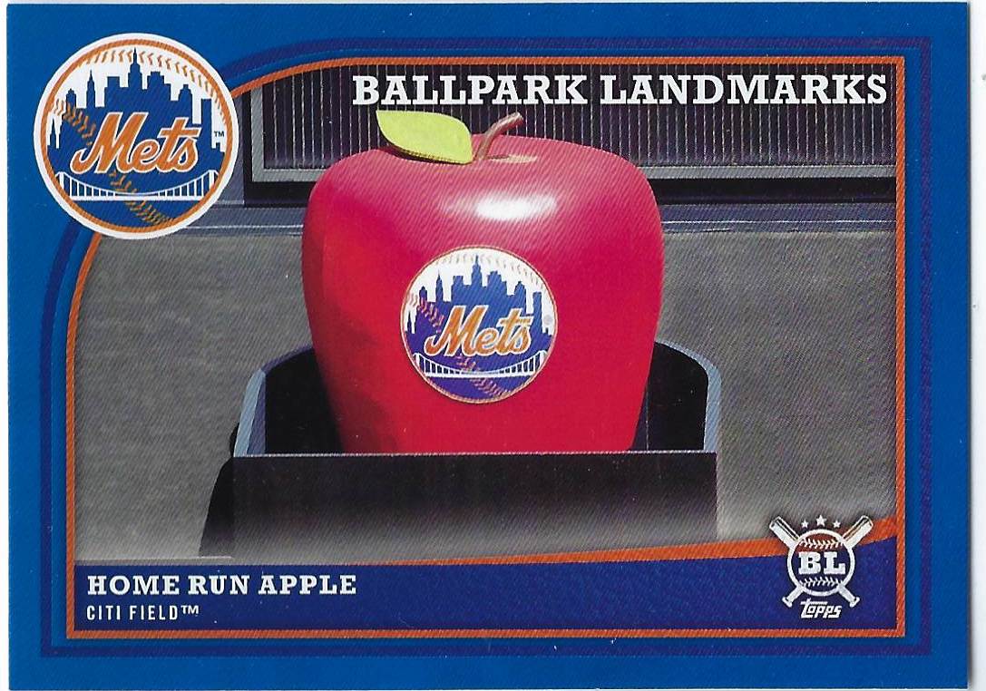
Because Topps Big League is officially returning in 2019, I'll definitely be looking at what Topps ends up changing and keeping from the original product. One of the stronger points of the base set was the ballpark landmark cards in addition to a solid selection of retired players. However, at least in my opinion, there were too many non-numbered parallels in the 2018 Topps Big League set.
#355 1990 Fleer Andy McGaffigan
As is usually the case, the light powder blue Montreal Expos uniform immediately caught my eye, prompting me to feature this card of Andy McGaffigan, not exactly a household name, on one of my frankenset pages.
Along with the Red Sox, the Expos are one of those teams that I will always collect beyond player collections. If I come upon an awesome Expos card, even if I don't collect that player, I will likely add that card to my collection.
#356 1998 Fleer Ultra Otis Nixon
I believe I selected this card because of how much I liked the photo featured, but besides that, there's not a whole lot drawing me to this card. The 1998 Fleer Ultra set is one of the most uninspired sets of the late 90s, and the background may be colorful, but there's not a whole lot of exciting elements besides the photo of Twins outfielder Otis Nixon dropping the bat.
#357 1992 Fleer Ultra Paul Sorrento
Based on the last 2 cards, I'm guessing that the main incentive to purchase packs of Fleer Ultra in the 1990s was the guarantee of Stadium Club-caliber images, both in retrospect to the quality and uniqueness of the photograph. After all, I sure wouldn't be drawn to Fleer Ultra solely by the set designs. I would need a little bit more to buy these cards.
#358 2007 Topps Heritage John Lackey
This is one of the first cards that come to mind when I think about the 2007 Topps Heritage set, a product in which I have dozens and dozens of duplicate cards. The light blue background pairs excellently with the rest of the card, the majority of which is red.
He may not have been the most well-liked teammate to have around, but Lackey aided both the Red Sox and the Cubs in winning the World Series in 2013 and 2016 respectively.
#359 1977 Topps Willie Randolph
This card, in particular, really put into perspective how committed Topps has been towards maintaining roughly the same Topps rookie cup design since the new style cup was developed in the early 1970s.
I'm not sure if they've featured it every year, but I'm certain that the rookie cup on Willie Randolph's 1977 Topps card is extremely similar to the one on Juan Soto's 2019 Topps card that I recently pulled.
#360 1975 Topps George Scott
Similar to how the Lackey comes to mind when I think about 2007 Topps Heritage, George Scott's 1975 Topps card is memorable for me for a number of reasons, ranging from the easily recognizable light blue Brewers uniform to the fact that I have this same card, only as a part of the 1975 Topps mini card set.
Subscribe to:
Posts (Atom)