Thursday, December 27, 2018

Frankenset Page #34

My plans to complete my ranking of Topps sets by each decade is still scheduled to be completed before the end of 2018. However, I'll be taking small breaks between the posts so there's a greater variety in what I post. 

Despite it being scheduled to arrive today, my Red Sox World Series set has not yet come in the mail at the time in which I started this post. So, I'll be doing the 34th frankenset page instead, featuring cards #298-306. 

#298 1989 Topps Chris James
A card like this is pretty much as good as you can get in a set like 1989 Topps. I like the purple and blue color combination for the Phillies' team name in addition to the powder blue jersey and the pink lining around the image. If the borders weren't unnecessarily too large, I could see myself becoming more fond of the '89 Topps set because of cards like this.

#299 2004 Fleer Tradition Mike Lieberthal
Even though they produce an extensive range of different products, I still wholeheartedly believe that the Baseball card market should not be monopolized by Topps. Fleer, my 2nd favorite card company of all-time, produced a similarly wide range of high-quality products from 1981-2005. I'd be incredibly pleased to see them return to the hobby in the coming years.

#300 2012 Topps Josh Hamilton
If Topps is going to produce a lackluster Flagship set like 2012 Topps, I'm at least pleased that they're able to include unique images from different angles like the Josh Hamilton card above. With countless cards nowadays featuring the typical photos for both pitchers and hitters, it's comforting to see images that are a little out of the ordinary.

#301 2017 Topps Heritage Martin Prado
The 2017 Topps Heritage set, no matter how one feels about the 1968 Topps design, was an incredibly well-made product. The recreation of the '68 design was near perfect, and I love the inclusion of many, many blue sky backgrounds. I just wish the photo included showed Prado in a black jersey rather than white.

#302 1993 Pinnacle Idols Delino DeShields
The Idols subset within the 1993 Pinnacle product is made up of players along with their idols, some of which I believe to be athletes and others not. In the case of 1993 rookie Delino DeShields, his idol was Malcolm X, and the result of which was one of the most special and unique cards from the junk wax era and one of my favorite Expos cards of all-time.

#303 1970 Topps Brant Alyea
It's a small collection, but I do have a binder of Washington Senators cards from the 60s and 70s before they eventually became the Texas Rangers. Most of my cards consist of 1970 and 1971 Topps with Frank Howard making up a good portion of my current Senators card total. In the case of 1970 Topps, the silver borders look especially sharp with the red hats and team name.

#304 2004 Topps Heritage Rocco Baldelli
The total number of cards I have from both the original 1955 Topps set as well as the 2004 Topps Heritage product are fairly limited, but one of the few I have from the '04 set is of current Twins' managers, Rocco Baldelli. 

He was once thought to be one of the next superstars of Baseball, but injuries got in the way of his career. He's worked his way up through the Rays' organization for years before being announced as the manager of the Minnesota Twins a couple of months ago.

#305 1977 Topps Mickey Rivers
Mickey Rivers was a key member of the 1978 and especially the 1977 New York Yankees World Series teams. A .326 hitter in '77, Rivers drove in 69 while also stealing 22 bases and played centerfield at a respectable level. Although I'm a pretty big fan of the set, I will say the orange color doesn't work for the Yankees in 1977 Topps.

#306 1981 Topps Juan Beniquez
Juan Beniquez seemed to embody the era he played in whether he was with the Rangers, Mariners, Angels, or any other team he played for throughout his career. He always seemed to have big hair and a colorful jersey in basically every Baseball card of the 1977 Gold Glove Award-winning outfielder.

Wednesday, December 26, 2018

Christmas' Best

In what has started to become a Christmas day tradition, my Dad and I opened up a box of 2018 Bowman's Best yesterday after it was released last Friday, a mere 4 days before Christmas day.

Last year was the first time I had ever opened Bowman's Best when we grabbed a box of the 2017 set. It was a totally different experience than any other box of cards I had ever opened before. I'm not used to this high-end of a set, so I didn't fully know what to expect. I did fairly well last year, but nothing too special. This time, I was looking to step it up.

When I opened the box yesterday, I had a much better idea on what to expect than I did the year before. Not only did I know how the mini boxes worked with 2 autos per mini box and 2 boxes in the master box, but I had also seen the set design in breaks on YouTube as well. 

As always, there's a definite modern approach to the set with a silver, sleek design and some color in the background as well. Last years' cards were definitely more colorful, but that also made the numbered refractors less special. Therefore, I must say that I'm more fond of the 2018 product.

The 5th card of each 5-card pack is guaranteed to be a refractor of either a prospect or rookie/veteran. The rookies and vets take up around 75 spots in the checklist while there are roughly 30 prospects. This means that you don't have to be super knowledgeable on prospects to appreciate the set since most of the base set consists of current MLB players.

I always have to take note of how many Red Sox cards I'm able to pull from any box break, and Bowman's Best delivered some pretty nice cards. I may not have pulled a much-desired Craig Kimbrel, but base cards of Betts, Benintendi, and J.D. Martinez came my way along with some inserts that I'll show off later on.

Unlike 2017 where the player name was moved to the other side of the card, this years' Bowman's Best prospect cards look vastly different when compared to the veteran and rookie base set. 

The background is still ultra-modern but in a more colorful and detailed way. There's far less separating the player name from the rest of the card, and as a whole, the prospect cards are different yet similar to the base cards at the same time, a very good trait in my opinion.

The 1 refractor card per pack can also be a prospect instead of a rookie/veteran, but they're a bit less common due to there being just 30 prospect base cards. However, the smaller checklist nor my limited knowledge of prospects would stop me from pulling a couple standout prospect refractors. The first is the Brendan McKay card above, a top pick from last years' draft, while the 2nd is at the top of this post; Vladimir Guerrero Jr.

In yet another way that this years' Bowman's Best set is similar to last years', the 2018 product features an insert set that pays homage to an insert set in a past Bowman's Best product. Last year, they recreated the '97 Best Cuts cards, but this year, they went with the '98 Best Performers which can also be autographed, the case hit of this product.

There was a wide range of players that I pulled with 1 retired, 2 current stars, and 1 prospect. Of the 4, both the Jose Canseco and the Didi Gregorius are available for trade.

Early Indications is a pretty standard prospect insert set, indicating that the players within the checklist have the ability to become stars in the coming years. It's nothing to write home about, but I was able to pull a couple well-respected prospects; the #3 pick in the 2017 MLB Draft, MacKenzie Gore, and one of the prospects traded to the Dodgers for Puig and Kemp, Jeter Downs.

As far as the insert set designs go, the Power Producers would have to be my favorite of the bunch. I'm not sure if the set is limited to just prospects, but the 2 guys that I pulled are both minor leaguers. First up is another Red Sox, 3rd baseman Triston Casas while on the right, we have 2-way talent Brendan McKay who is seen hitting this time due to the set being called Power Producers.

In 2017, I pulled a purple refractor of Amed Rosario as my 1 numbered refractor of the box, back when he was still a prospect. This year, I pulled a beautiful-looking purple refractor of Cody Bellinger, numbered 95/250. 

I haven't seen any other colored refractors from the set in-person besides purple, but I have no doubt they look fantastic. As of now, I plan on adding this to my Cody Bellinger player collection, but my mind could be changed by the right trade offer.

Each box guarantees you 1 atomic refractor base card of either a prospect or a veteran/rookie, and I don't think I could've done any better than Mike Trout with the possible exception of Shohei Ohtani and Ronald Acuña Jr. Trout's been a top 3 player in Baseball for years now, spending a good deal of time arguably at the #1 spot. He's the face of the game, and I know this card will be a fabulous addition to my Trout player collection.

So you've seen insert cards and the atomic refractor, but the luck didn't end there. In fact, the 2 previously mentioned cards combined and the result was nothing short of stunning.

Falling at 2 per 8-box case, the 1998 Best Performers atomic refractors look absolutely breathtaking, both in-person and when scanned. I haven't taken an in-depth look at the checklist, but it's hard to find for me to find a player I'd rather have in this design than Pedro Martinez. Usually, I'm not too crazy about insert parallels since I see them as a way for Topps to make more money, but for these, I'll make an exception.

I'm also willing to make an exception for the Neophyte Sensations card as well after pulling my 2nd atomic insert refractor of a Red Sox player. This time around, it's Rafael Devers, representing the Red Sox in this rookie-based insert set. 

As far as I know, the odds of pulling an atomic refractor from this insert set is extremely low, since one can't even expect a regular insert card from this set in a hobby box (the odds are 1:18 packs, and you get 12 packs per box).

However, despite the seemingly endless possibilities for inserts and refractors, the main draw to Bowman's Best is the 4 guaranteed on-card autographs per box. Last year, the best autos pulled were Blake Rutherford and a Jake Burger refractor. Let's see how I do this time around.

The first of the 2 mini boxes didn't deliver the biggest names, but I could've done worse. The Connor Scott card has its perks because he's a position player while the Grayson Rodriguez is at least a refractor and not a base auto. As always, the blue sharpie used for on-card chrome autographs looks fantastic, though it wasn't the best start to the box as far as autographs go.

After that, the bar was raised, big time.

At first, I didn't think too much about pulling a Nolan Gorman autograph but that would quickly change. As it turns out, Gorman is #73 on the MLB top 100 prospects list, and his base autograph is going for a pretty decent total on eBay, especially for a non-numbered autograph. I even saw that he was included in the Power Producers insert set, proving that he's pretty relevant and has a decent chance to develop well given how stable of an organization the Cardinals are.


As always, I've saved the best for last, an autograph of a player that even with my minimal knowledge of cards, I instantly recognize the name. Here it is, the crown jewel of the entire box.

Wow, I can definitely say I wasn't expecting that. Instantly becoming the best autograph I've ever pulled of a prospect, this hit was nothing short of huge, even if Adell's journey through the minors has barely hit AA. He's the #15 prospect on the top 100 list, and he was drafted at #10 in the 2017 MLB Draft.

Furthermore, this is an insert autograph parallel from Early Indications, the insert set for some of the best prospects in the minors. It's a gold parallel numbered 44/50, so needless to say, it's a pretty difficult card to pull due to how increasingly rare insert sets have become.

While I know a bit about him, my knowledge of prospects, their autographs, and value aren't too strong, so I'm not sure what this card is worth since I haven't seen another for sale yet on eBay or any other site. Therefore, any tips on the value of this card, information about Jo Adell, or prospect autos, in general, is greatly appreciated.

I hope you all had a joyful holiday and a happy New Year as well.

Monday, December 24, 2018

Ranking Topps Sets by Decade; 1980s

After the 1970s, fewer and fewer Topps Flagship sets had the impact that previous products had. The last 2 decades of Topps sets contained numerous standout products that remain well-loved and sought after to this day. 

However, the 80s lacked those sets, not completely, but quite a bit. Ultimately, along with Fleer, Donruss, and Pinnacle beginning to produce their own sets, this commenced what we recognize today as the over-production and junk wax eras of Baseball cards.

My overall impression of 1980s Baseball cards is "average" which is not necessarily a bad thing. Simply put, it doesn't have as many memorable sets as other decades, and the iconic sets that it does have ('83, '84, and '87) are being over-represented by Topps throughout the 2010s, resulting in the Topps sets of the 80s coming off as rather lackluster.

The 80s fall right in the middle of the best decades for Topps sets since I know for sure the 90s were worse and the 2000s and 2010s are a toss-up when compared to this decade. I'm currently collecting 1 Topps set from the 80s and that would be 1983, one of my favorites from the entire decade. 

Time to get started, beginning with a set that I was surprised ended up this low on the list, 1989 Topps.

#10 1989 Topps
Before I notice anything else, I'm instantly drawn to the unnecessarily large borders that take up a lot of the base cards of the 1989 Topps product. If you look at nearly any other set, you'll find very few products in which the borders are so thick all the way around the card, and I think that's part of why the 1989 Topps set doesn't appeal to me. Similar to 1978 Topps in terms of how minimal it is, the set appears incomplete, and the lack of originality is ultimately the sets' undoing.

#9 1986 Topps
1986 comes to my mind as one of the most average Topps sets of all-time, and it's unfortunate given that the base design had quite a bit of potential. However, the team name is far too large and takes up way more space than it needs to. Some sets, like '77 Topps, have pulled this off, but the drab set design that is 1986 Topps doesn't make the card or the huge team name any more appealing to the collector.

#8 1981 Topps
I know that 1981 Topps is a very well-loved product by many collectors, but I struggle to find what people see so appealing about the product. Don't get me wrong, it's far from bad, but there's nothing too special about this set aside from the hat with the position and team name on it. If not for the different colored caps, this set would attract attention for all the wrong reasons instead of for the things it does right.

#7 1980 Topps
Whenever I look at cards from 1980 Topps, I always get sucked in by the mini ribbons/banners right away. Despite the visual appeal, the more attention I pay to the set, the less interested I become in it. I will say that I'm very fond of the light blue card backs, and the banners don't get too boring throughout the 700+ card set thanks to different colors. However, the 80s still have some strong competition, and it's those other sets that pushed 1980 Topps all the way down to #7.

#6 1985 Topps
1985 Topps does an excellent job of utilizing all the space it has to create a detailed card that doesn't feel too cramped aside from the logo cutting off the team name just a bit. While the inclusion of the team's logo isn't needed, the border size on the base cards is pretty perfect. The green and red "Christmas backs" are very fitting for this time of year as well. Even though I barely have a dozen or 2 cards from this set, that total is enough for me to appreciate the product.

#5 1987 Topps
If not for Topps' desire to include 1987 Topps in numerous sets this year (minis from I believe 2012, last years' 3-series insert set), then I would've ranked this set a spot or 2 higher on the list. Unfortunuetely, the 2nd and final Flagship set with wood borders will have to settle for #5. The set still has numerous strong points, and it relies on more than just the wood to create some excellent cards. It's just a shame the set had to be so huge, taking away from the uniqueness of the cards.

#4 1988 Topps
Quite the opposite from 1987 Topps despite being the subsequent Flagship product, 1988 Topps is very underrepresented, having never been included as an insert set or even as part of the Topps Archives base set. I see the product as an attempt at what made the 70s so great for cards; different color combinations and solid pictures. It may not be able to stack up to the sets that the 70s put out, but by no means is 1988 Topps a poor effort.

#3 1984 Topps
Famous for the Don Mattingly rookie card, 1984 Topps was the final set that had the slightest bit of the 70s included within it. Bright and unique colors like pink and purple are used to write the team and player name while the set builds off what was successful the year before in 1983; using 2 images on 1 card. Everything also fits together very well throughout the product with nothing appearing out of place whatsoever.

#2 1982 Topps
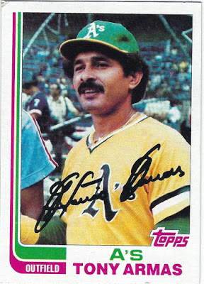
Even though it was represented in both 2013 and 2017 Topps Archives, 1982 Topps or the "Hockey stick set" features one of the most interesting designs I've ever seen. Each card consists of 2 colors in addition to the white borders and photo, a feature fairly rare with other sets that include logos or little color at all. For the A's, those 2 colors are pink and green, a crazy combination that, like nearly every other duo of colors, work very well together.

#1 1983 Topps
Despite their being a decent-sized lineup of above average sets, nothing comes close, in my opinion, to the near masterpiece that is 1983 Topps. The 2 photos on 1 card works better than it does in '84 Topps as well as the '63 set from 2 decades prior. Topps once again featured just 2 colors that, apart from the bottom of the card, appear in slim lines that don't take away from the rest ofthe set.

I like the way 2 colors are designed to connect the top part of the card to the bottom. If this wasn't carefully designed, the cards would seem like 2 different sets instead of 1. To their credit, Topps took a risk and it paid off, big time, with one of the best sets of all-time being the result.

Sunday, December 23, 2018

Ranking Topps Sets by Decade; 1970s

I've now reached the golden age in terms of Baseball cards, the 1970s. In addition to numerous memorable Topps sets, Kellogg's made a name for themselves and their iconic 3D card sets throughout this decade as well. I've already completed 2 Topps sets from this decade (1972 and 1975) and am currently piecing together 2 others (1976 and 1979).

Even with the 1970s containing more well-designed sets than nearly any other decade, I was able to decide the order for this list fairly quickly. There are a couple of so-so sets, a few incredible products, and finally, 3 sets or so that will go down in history as some of Topps' best efforts.

Additionally, one of the main themes of the 1970s, not just for Baseball cards, was the wide range of bright and bold colors. Each and every set makes an effort to include different colors depending on the team with some sets, like 1975 and 1976, having more color than others. 

Sets like 1970 and 1971, on the other hand, feature recognizable silver and black borders respectively.

#10 1978 Topps
1978 Topps appears to be the only set that doesn't fit in with the rest of the 1970s set, mainly due to is sub-par set design and its inability to excite collectors. Don't get me wrong, there are still plenty of well-executed cards within the set, and the card backs are fairly strong. However, an image with a white border and a cursive font do little to amaze me given what else is available from this era.

#9 1974 Topps
It's not that the 1974 Topps set has the worst set design of the 70s, that would be 1973, but this set, in addition to 1978, does little to stand out. With nearly every set across the 70s decade being a winner in one way or another, each set is in need of 1 particular factor that sets it over the edge. While it's a respectable all-around set, 1974 Topps doesn't necessarily have that "it" factor to set it over the edge.

#8 1973 Topps
If not for the abundance of awesome images and a wide variety of different angles for said photos, 1973 Topps would end up dead last on this countdown. No matter how much I try, I can't get behind such an uninteresting set design, no matter how intriguing the images are. However, the top tier photos do their part to elevate the 1973 Topps set, a product that would be lost without cards like the Ed Acosta card above.

#7 1979 Topps
Just like 1960 Topps seems to fit in better with the 1950s Topps sets rather than the 60s, 1979 Topps has more of a 1980s style rather than a 70s base set design. As you can tell, Topps began to shy away from using too much color towards the end of the 70s, the exact opposite of what they did in sets like 1975 Topps. My favorite part of this set is easily the old-school Topps logo placed on the Baseball in the bottom left corner. 

#6 1977 Topps
As we saw in this years' Topps Archives set, 1977 Topps is certainly an above-average product with big, colorful team names in addition to a variety of different photos. However, in a decade like the 1970s, simply an above average set doesn't get you much higher than 6th on the list, a testament to how strong the decade remains, even to this day, for Topps Flagship sets.

#5 1970 Topps
Now that I'm into the top 5, I've reached some of the greatest Topps sets of all-time in addition to the best products that the 1970s has to offer. In terms of the 1970 Topps set, I'm incredibly excited to see this grey-bordered set return for 2019 Topps Heritage. I've always loved the simplicity of the grey-bordered design, even if it does become slightly repetitive in the 720-card set.

#4 1976 Topps
I really wish this set got more attention, because 1976 Topps, to me, embodies the 1970s as a whole more so than nearly any other product released that decade. I love the All-Star stars especially, something that we should see more of since All-Stars players are supposed to be considered stars The amount of color on the card is perfect, but it's the photos, especially Johnny Bench's card, that make the set what it is.

#3 1975 Topps
1975 Topps would likely crack the top 5 on my countdown of favorite Topps sets of all-time, but in a decade like the 70s, the highest I can rank it is #3. The best thing about the set is that because of how many color combinations there are, I can never find myself bored while looking at 1975 Topps cards. Nearly every part, from the size of the team name to the position on the baseball, is frankly brilliant, a testament to the peak of Topps' greatness in the early and mid-1970s.

#2 1971 Topps
If Topps could execute another black-bordered Flagship set as well as they did back in 1971, it would easily become the best selling Flagship set of this century, and rightfully so. Simply put, the 1971 Topps set is a stroke of genius in many different ways. The borders are just the right size while there's nothing too crazy going on. Each tiny bit of space is maximized while also making sure that the card isn't cramped. 

Plus, who doesn't like black borders?

#1 1972 Topps
Not only is it the best set the 70s has to offer, but 1972 Topps will forever hold the title as my favorite Topps set of all-time, a true masterpiece of a set. Even without including the player's position on the front of the card, 1972 Topps is a beautifully designed set with a perfect balance between the color, team name, and image, all taking the shape of an arch.

The font that the team name is written in combined with the shading is very 1970s, the best compliment I can give a sit like this. Not only is it the best-designed set I've ever seen, but it's the first Topps set I ever completed myself, I milestone I reached earlier this year.

The 1970s had more fantastic sets to offer collectors than any decade in Baseball history. Next up, I'll go over the 1980s, a decade that for better and for worse, changed Topps Flagship sets forever.