
As I promised yesterday, I am doing a top 5 cards of the other player to be elected to the Hall of Fame via the Modern Era Committee, 4-time World Series champion Jack Morris.
When it was announced that Jack Morris and Alan Trammell were elected, I was very content. I was happy for both of these players because they both had such successful careers. They arguably should've been elected before now, but I'm just pleased that they both get to be elected to Cooperstown together.
My total amount of cards in my Jack Morris collection is 19, which I certainly hope to rise in the coming months. This could happen if his production goes up after being elected. Anyway, here are my 5 favorites.
#5 1992 Score World Series MVP

The World Series MVP award is a very prestigious award. It signifies that you were the biggest part of your teams' success during those 4-7 games and that you should be recognized for it. That's why it was such a big deal when, in 1991, after winning his 2nd of 4 World Series' that Jack Morris was awarded the World Series MVP as a member of the Minnesota Twins. This card shows a picture from one of Morris' World Series starts in which he pitched incredibly, especially for being 36 years of age at the time. And while the image is blurry, it gives us a very clear picture of Morris' dominance throughout his career, specifically the 1991 World Series.
#4 1982 Topps All-Star
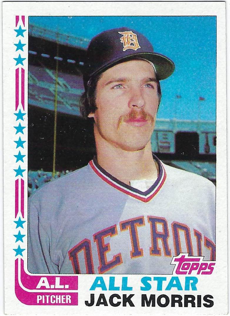
I love the All-Star designs on many Topps flagship sets as they add something different to the card. The 1982 set is a perfect example of that. The color combination is pink and light blue, which when put together surprisingly makes an amazing combo for a baseball card. The stars along the side along with the pink lines continue the "hockey stick" design unique to 1982 Topps, but also makes a big enough difference in the set itself. I also love the jersey on the card, which is the same one I pointed out in my post yesterday. And I know the first 2 cards have been pretty blurry, that's just how the 80's were. But don't worry, the next card's picture is very different from the first.
#3 1991 Leaf Studio

I own just 2 cards of Jack Morris on the Twins, and both of them were able to make this list. The Leaf Studio set was known for picture quality and putting high-quality, black and white images on cards, and they really did well with the Jack Morris card. As I've said before, I think black and white pictures on cards is great considering how infrequently we see them. I also like how the picture is black and white, so your eyes are drawn to that and the purple border. It's kind of like the 2 main parts of the card stand out so much, that you have to focus on both of them, which I like a lot. Leaf Studio did well with the balance of this set, which can be hard to do. That's why I felt I had to put it on the list.
#2 1986 Donruss Diamond Kings

The Diamond Kings card on the Trammell list was far more colorful than this one which has a less colorful background, but to me is just as interesting of a card. The 1986 Donruss set was a set that I liked quite a bit. My favorite feature was definitely the little baseballs on the sides of the card that I thought was just a very nice detail. I also like how on this card the picture of the player stands out more than the art. After all, it is called Diamond Kings and is focusing on players 1st, and art 2nd. Don't get me wrong, the art is still fabulous. But I appreciate how much attention they put into the images of the player, so I have to give Donruss credit for that.
#1 2006 Upper Deck Fleer Greats of the Game

I try not to put modern cards of older players at the top of my list, just because I feel like cards from when they played are better options because of how well they reflect the player. However, the 2006 Greats of the Game set is one of my favorite sets from the 2000s and this Morris card proves why. I love the green border in this set a lot as I feel it goes well with the silver nameplate and the gold trim. Green isn't really used a lot of sets which is a shame, because of how well cards like this pull off the color. I also love the image chosen of Morris, and of course, I'm always a stickler for vintage jerseys, so that always helps. This card really has everything, even down to Morris' number, so for those reasons, I put it at #1.
No comments:
Post a Comment